Volufixion
OVERVIEW
Role:
Project Lead
Timeline:
~ 3 weeks (30 hours)
Software Used:
Adobe InDesign, Photoshop, Illustrator
Project Details
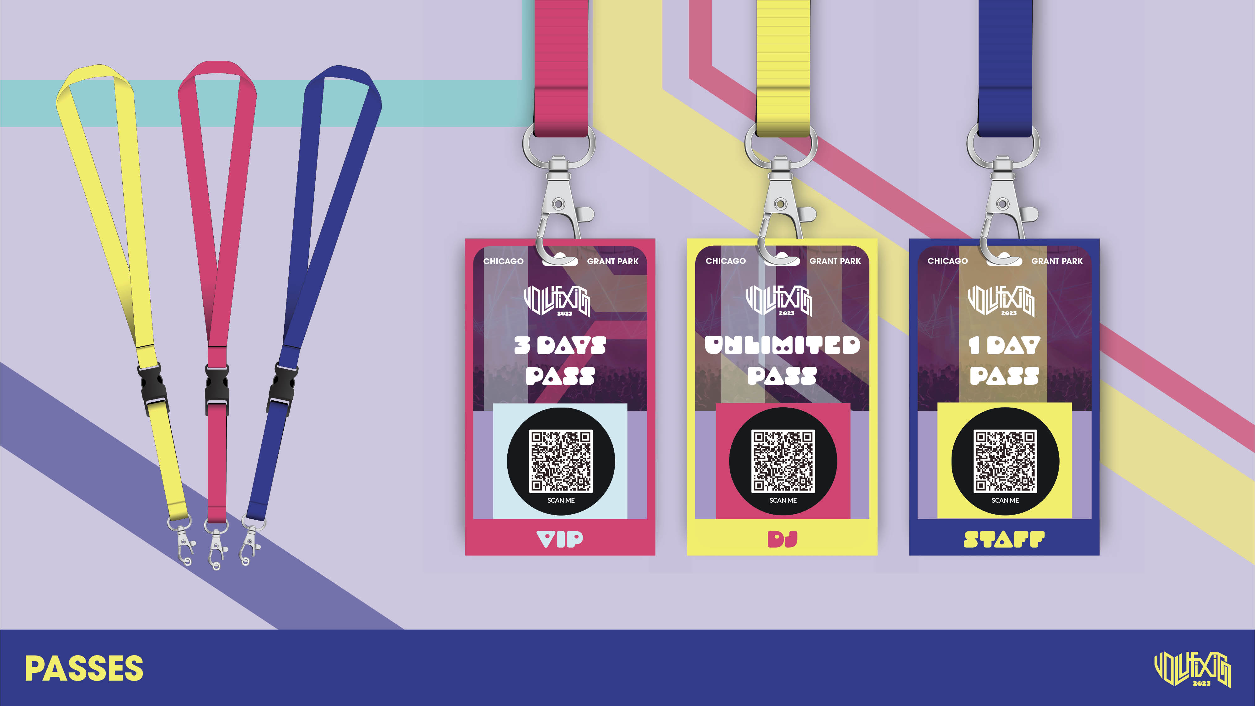
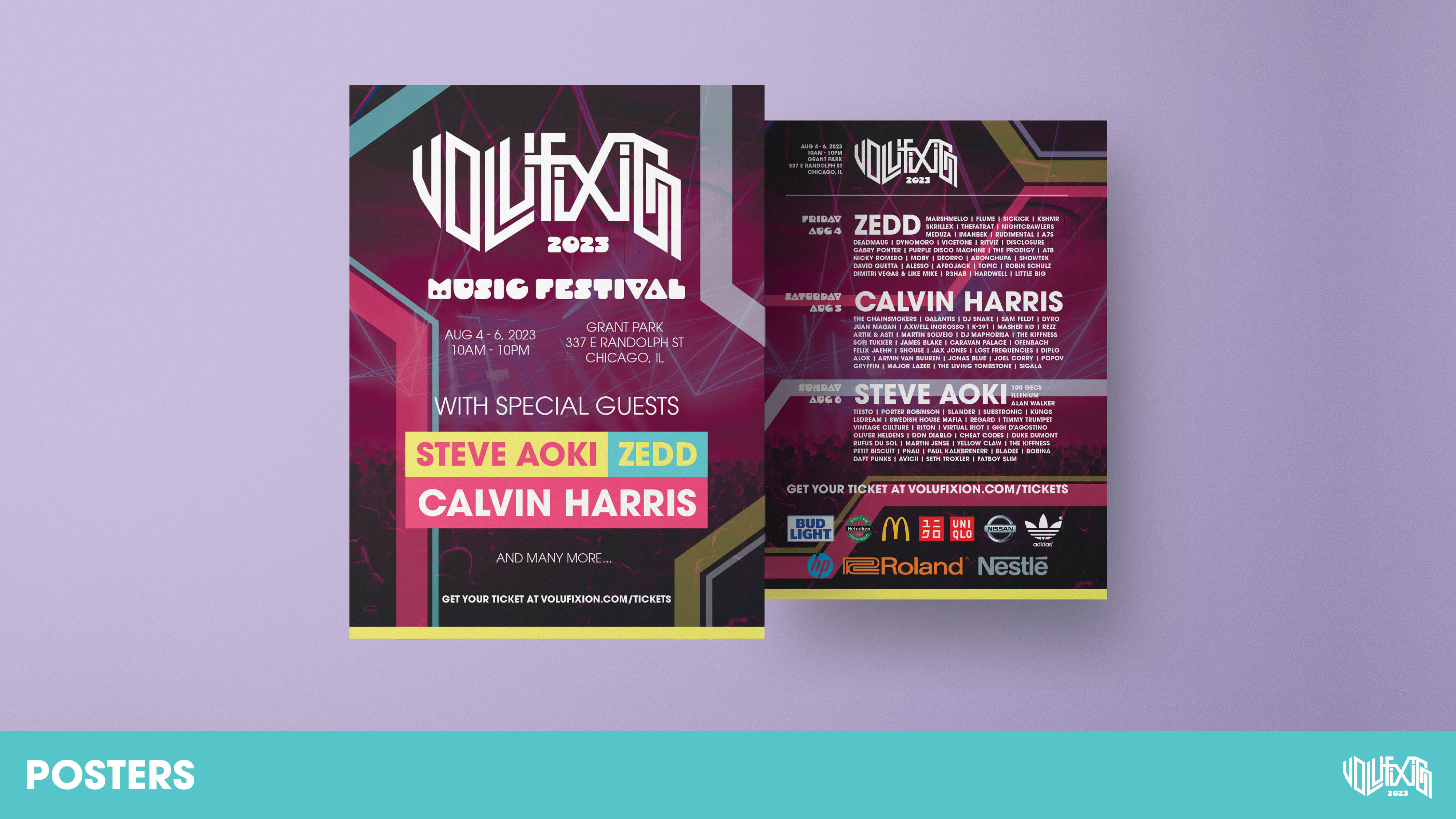
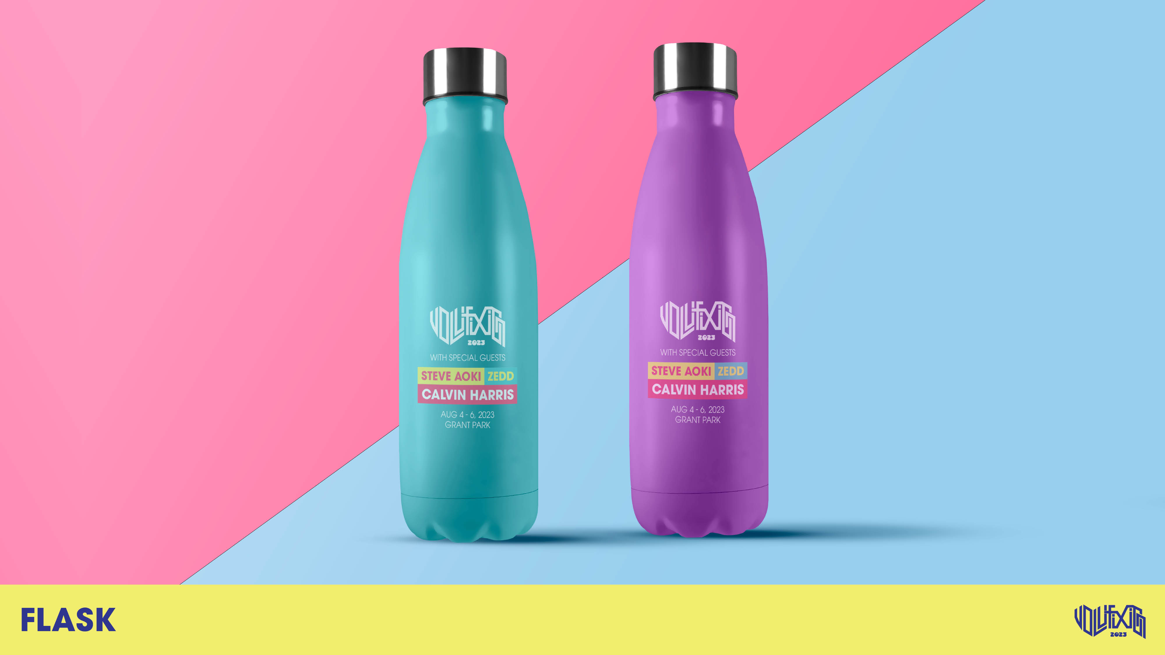
Volufixion is an electronic music festival that features many music artists. Crafting comprehensive design package to promote the festival, starting from logos to posters, badges, merchandise, and social media posts. Harmonizing the brand identity with the music style.
Project Goals
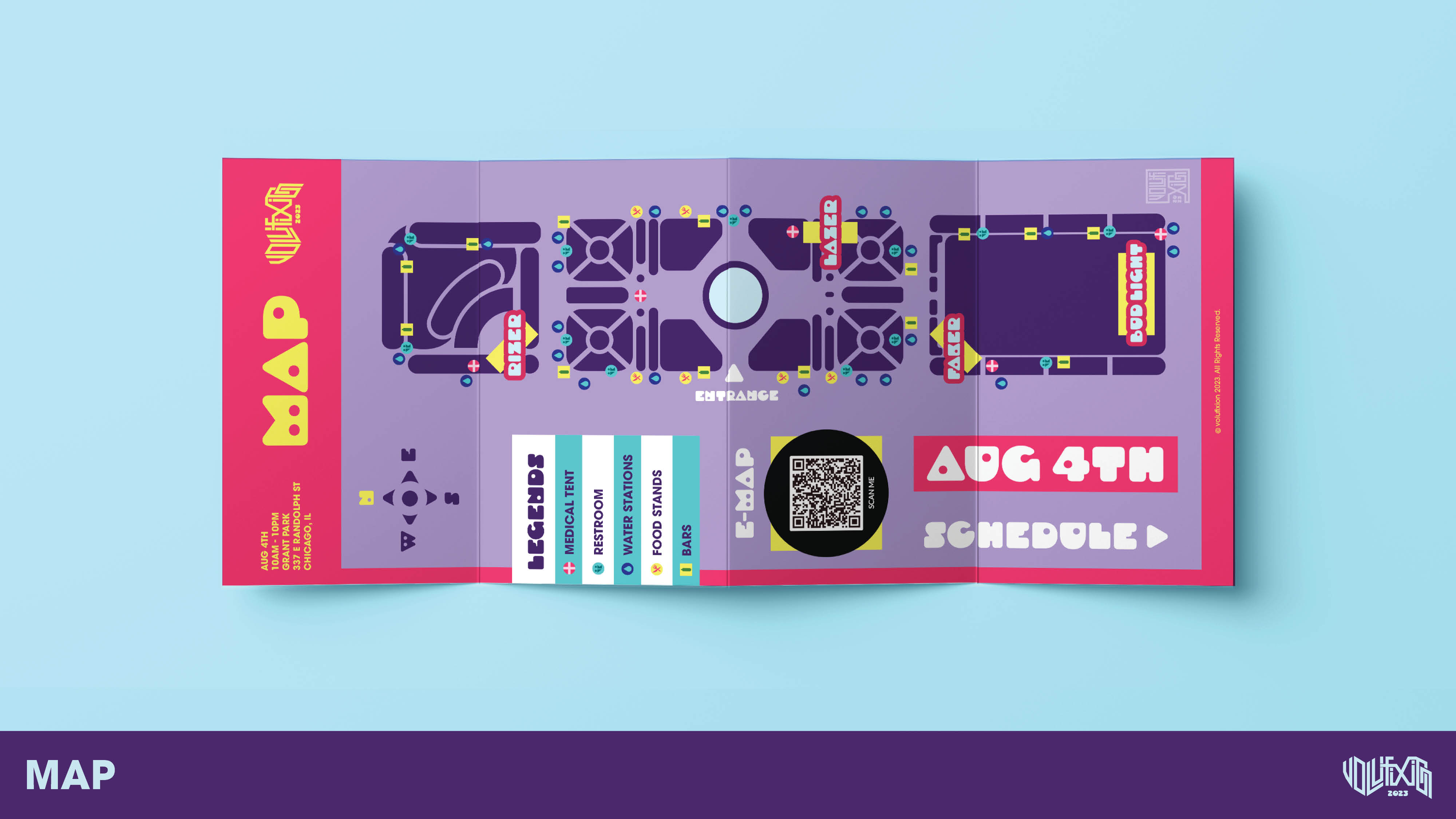
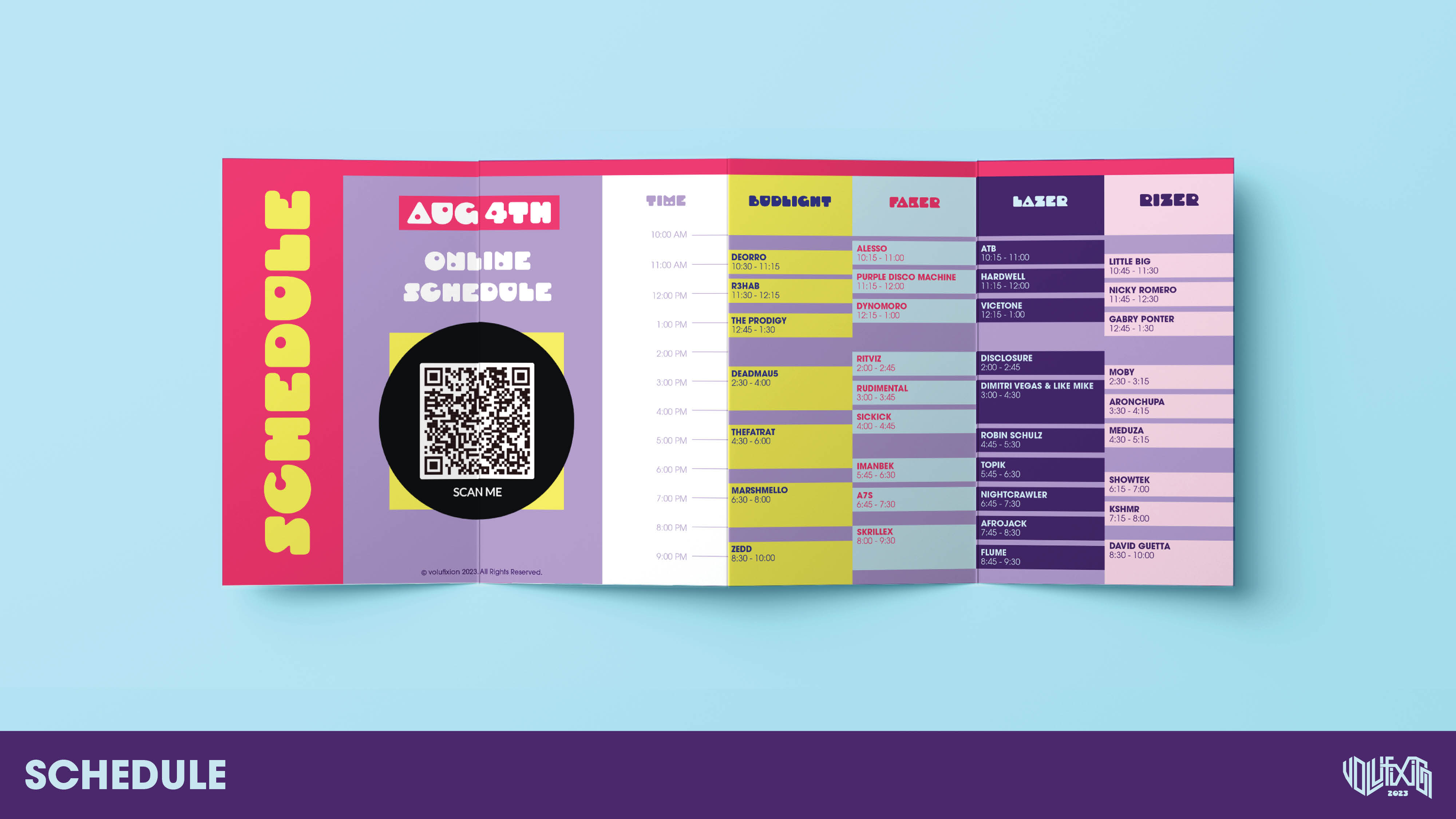
Improving organizational skills and ensuring consistency across the entire festival brand, including layouts, colors, and typography. Exploring and implementing diverse grid systems across various mediums while retaining uniform content.
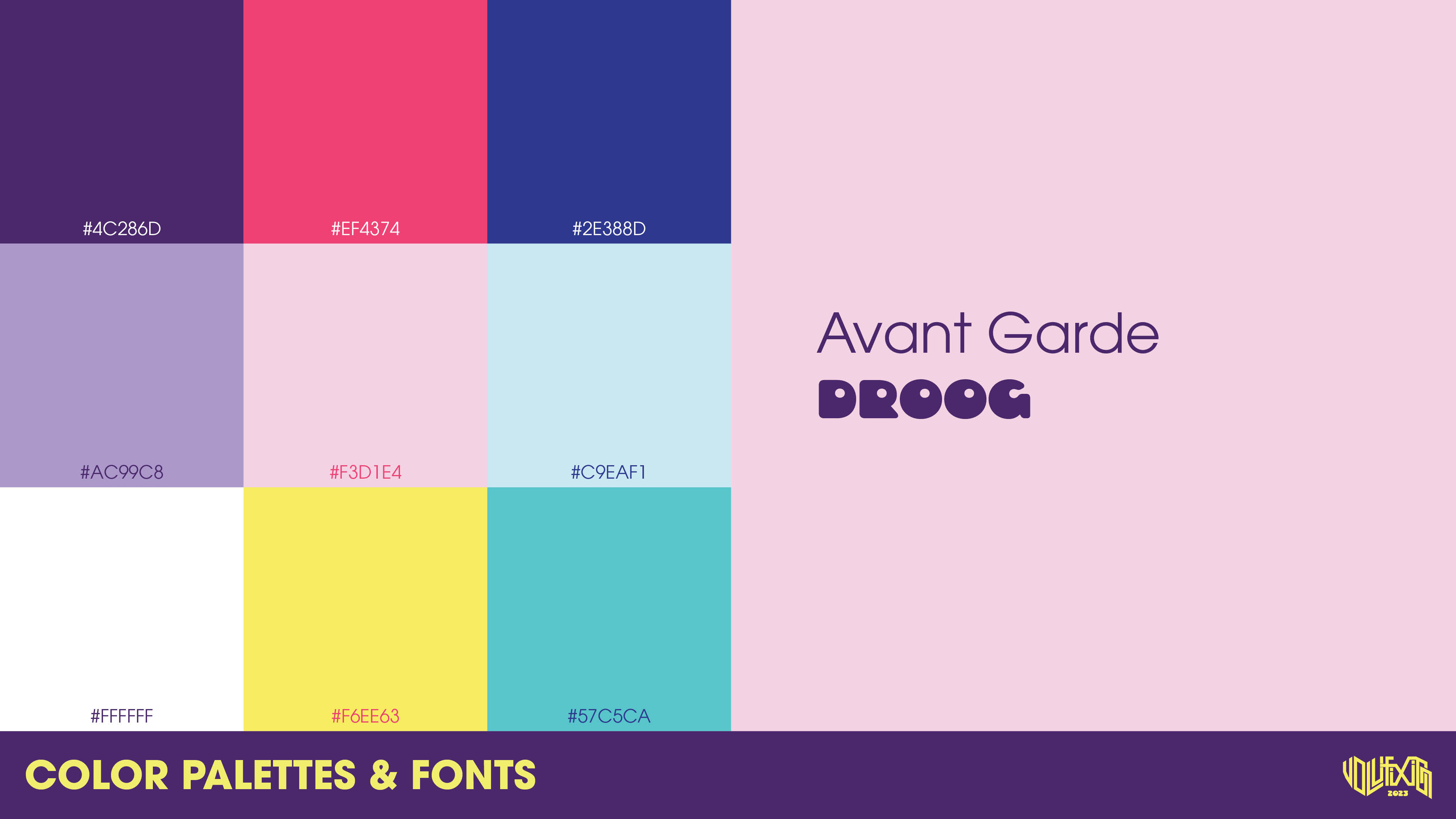
For the brand to be unified and follow the same structure, there needs to be a color palette and fonts that should be used to maintain consistency and unity.
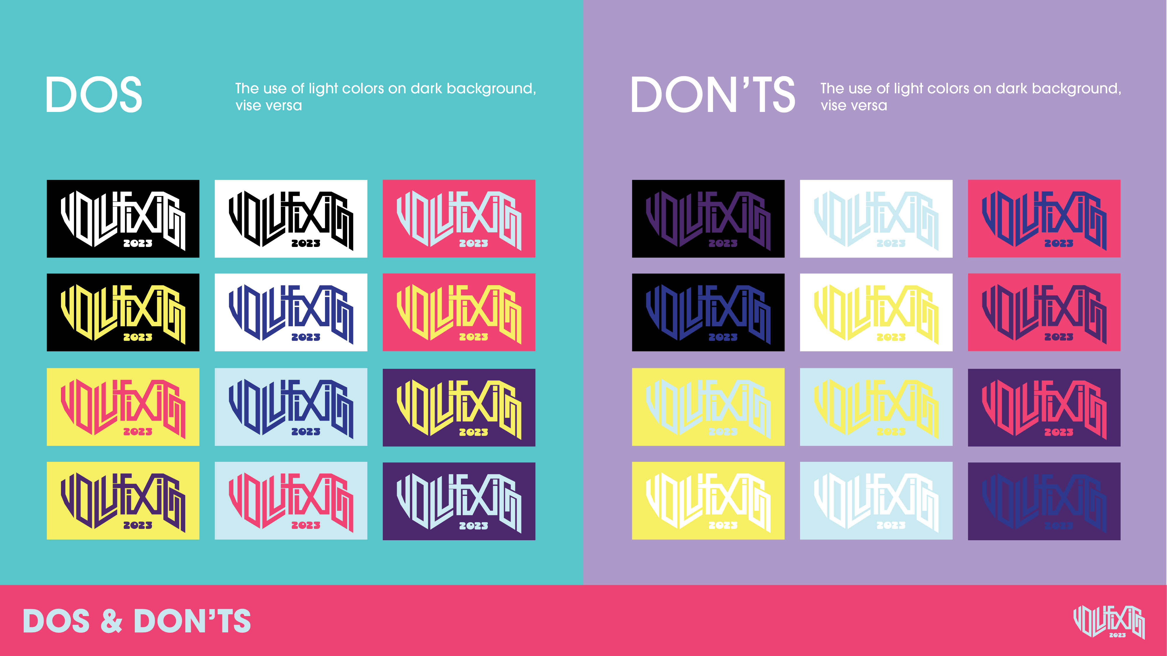
Logo color usage also need to be addressed to avoid any misused or unwanted combinations. Out of all the colors above, these are the color combinations that are recommended to use and not recommended.
REFLECTION
What I learned
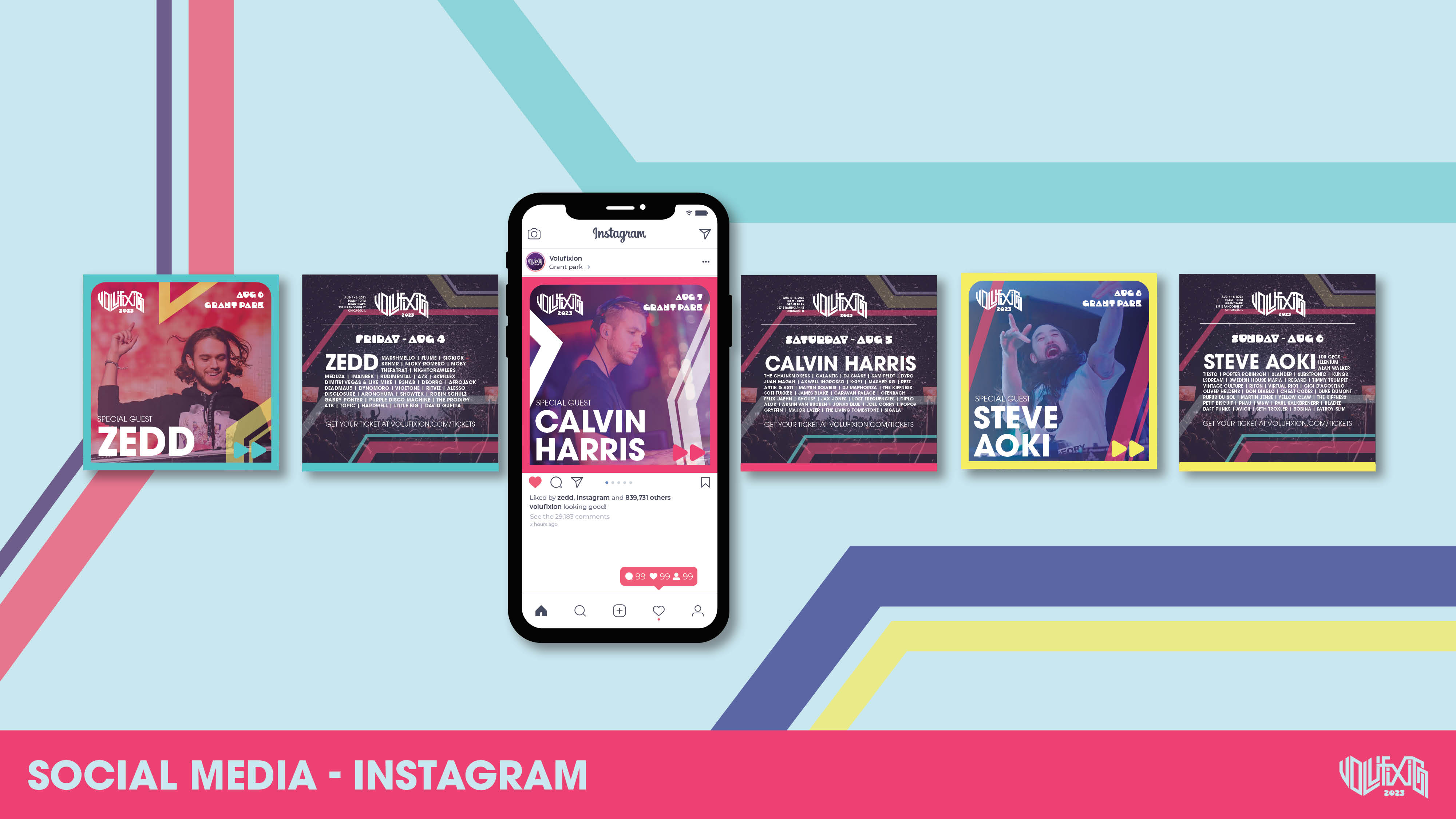
At the beginning of the project, I made a mistake by not keeping the style consistent. Fortunately, I quickly fixed this by revisiting the main style and create an element that could be applied across different mediums. Finding a flexible element and colors helps maintain brand consistency, cohesion and unity.
What could be improved
The main logo could be significantly improved and aligned using a grid layout. I have also considered making a secondary logo to be used in a vertical layout. This leads to the idea of creating a brand guideline that others can use. More poster variations can also bring different type of audience.
