Olympics Infographics
OVERVIEW
Role:
Project Lead
Timeline:
~ 2 weeks (20 hours)
Software Used:
Adobe Illustrator
Project Details
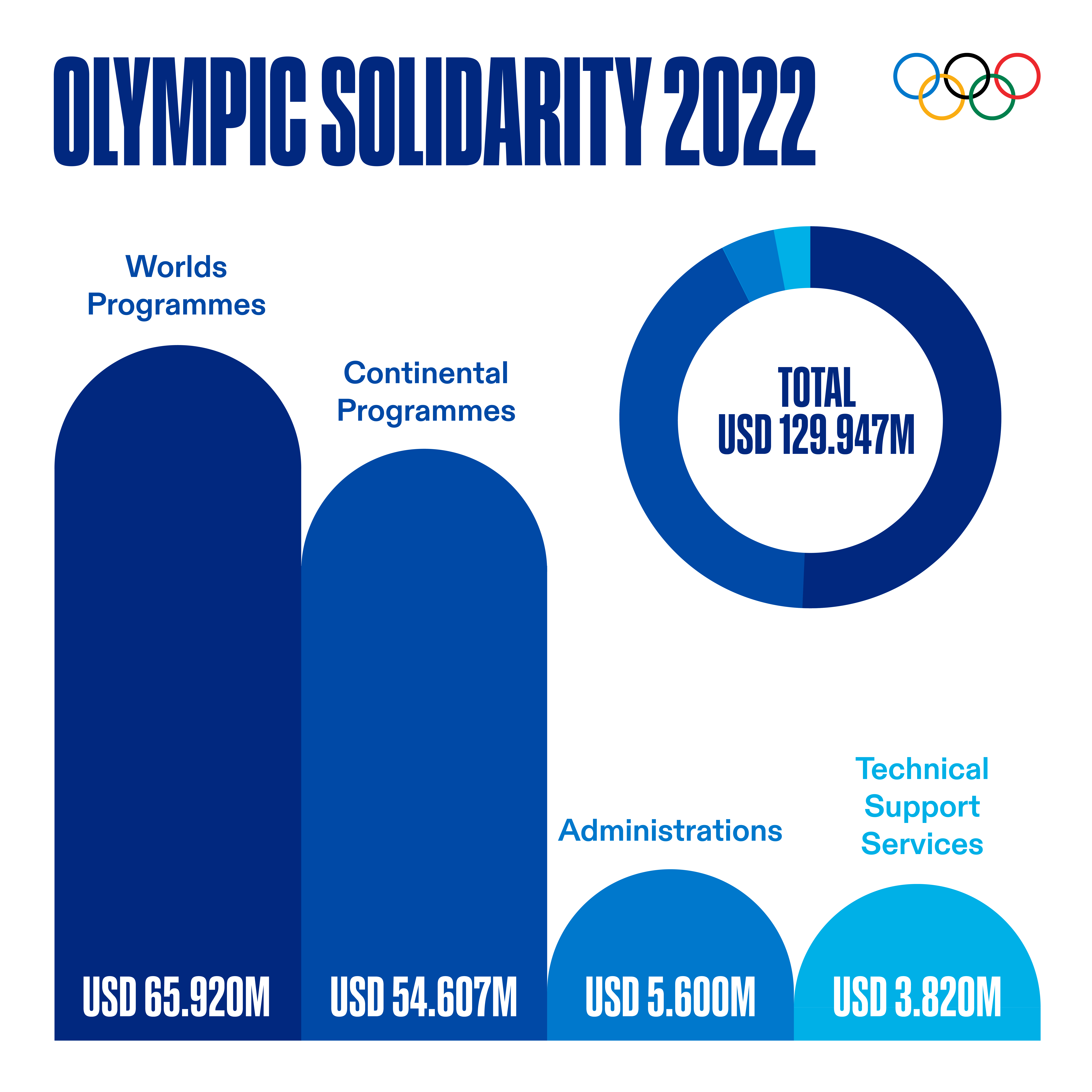
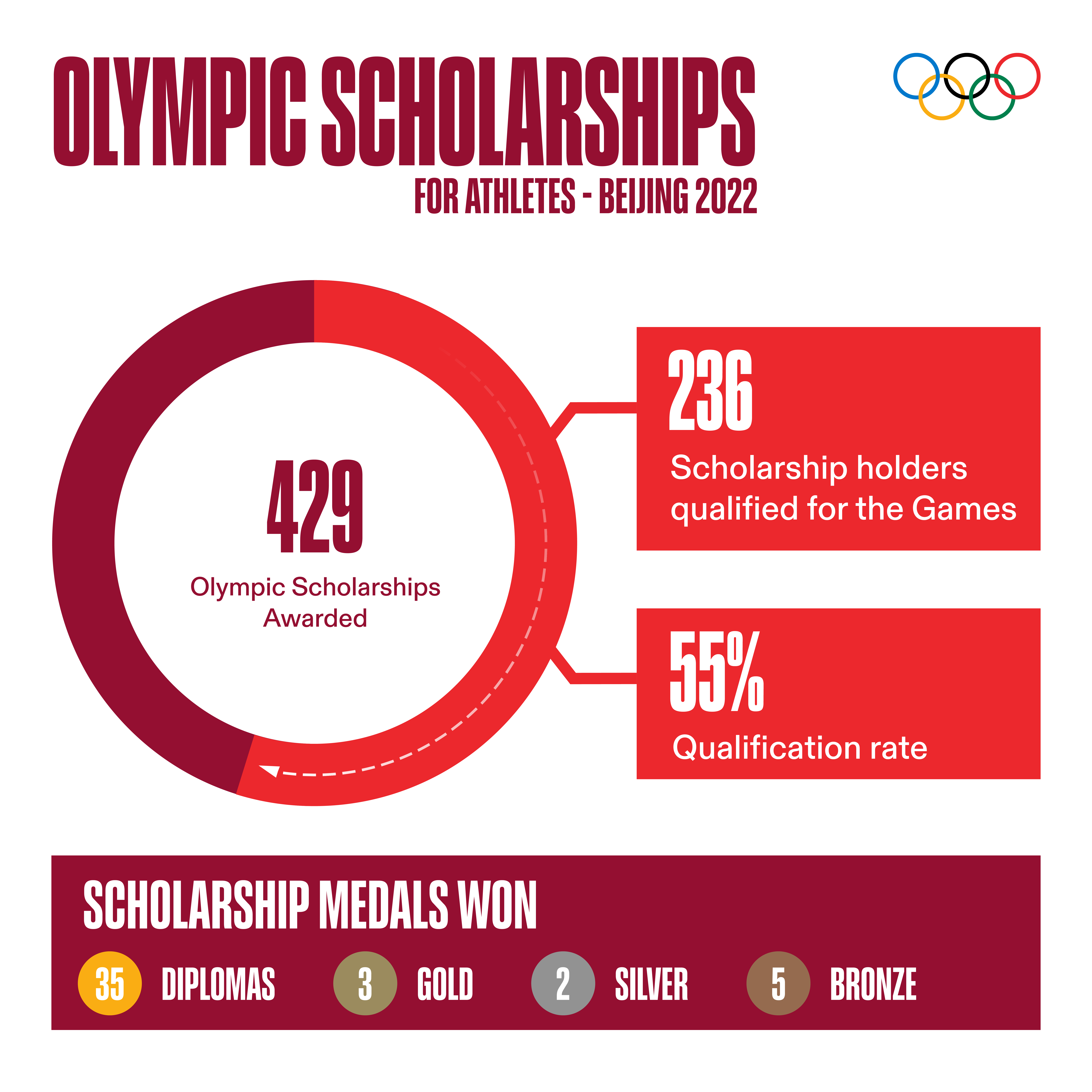
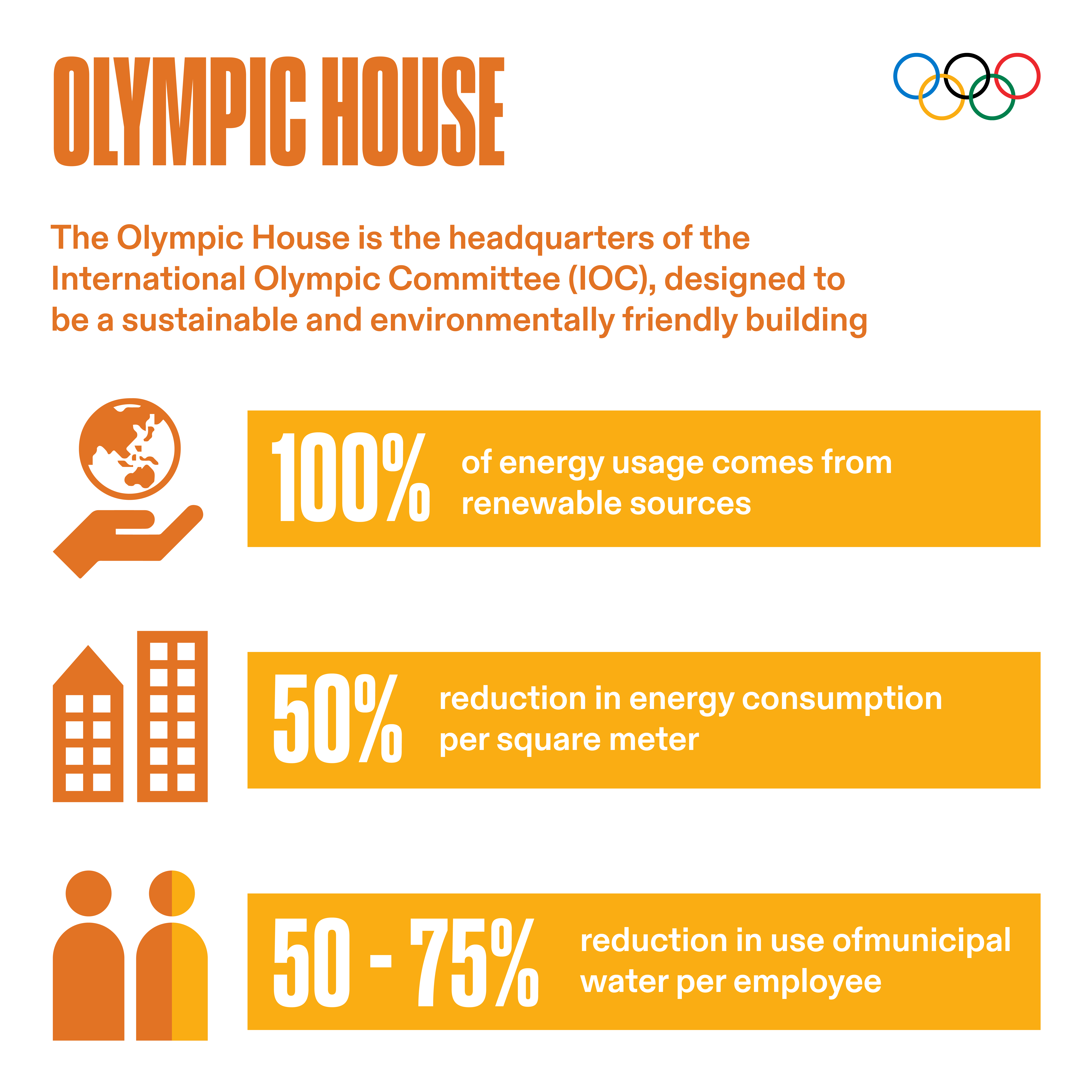
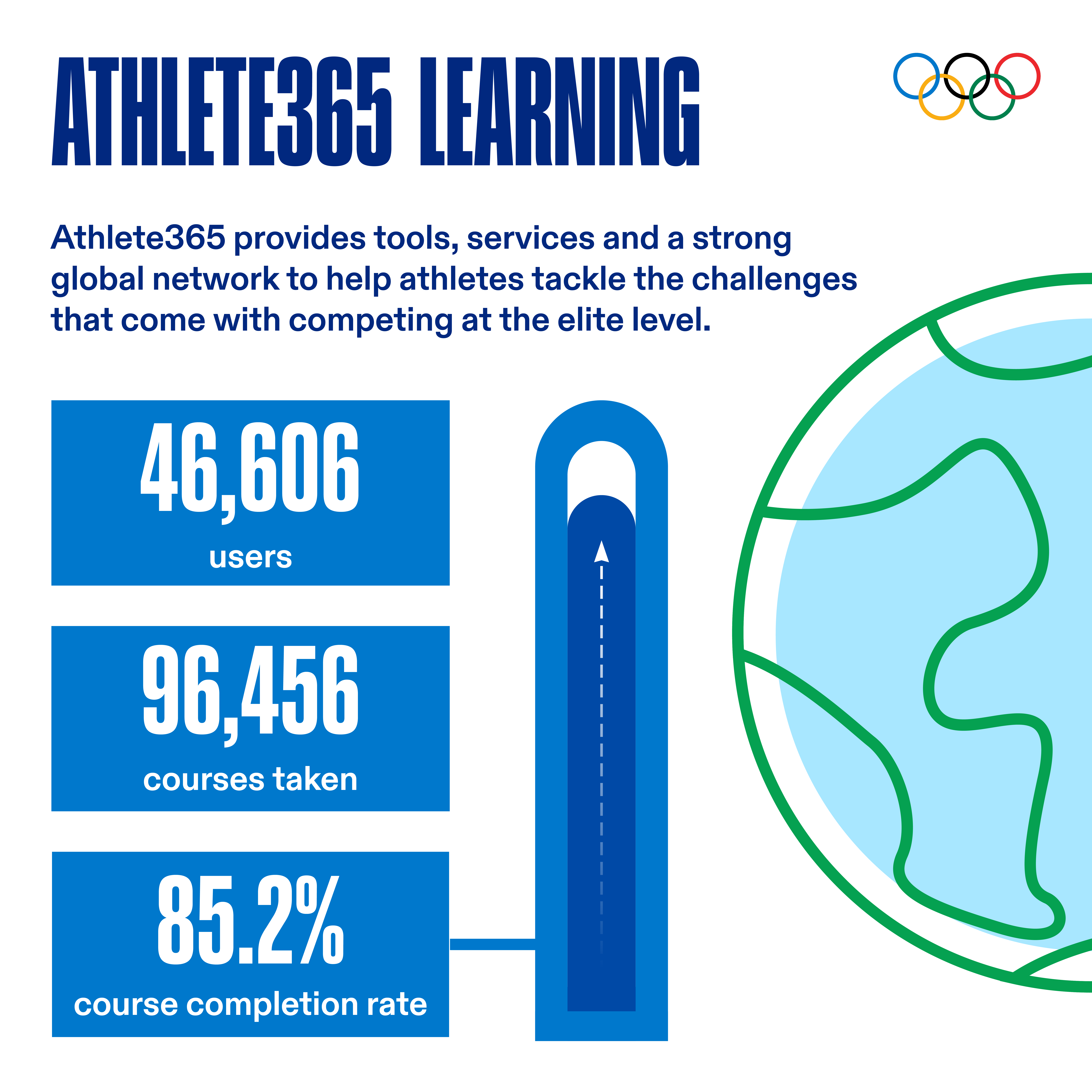
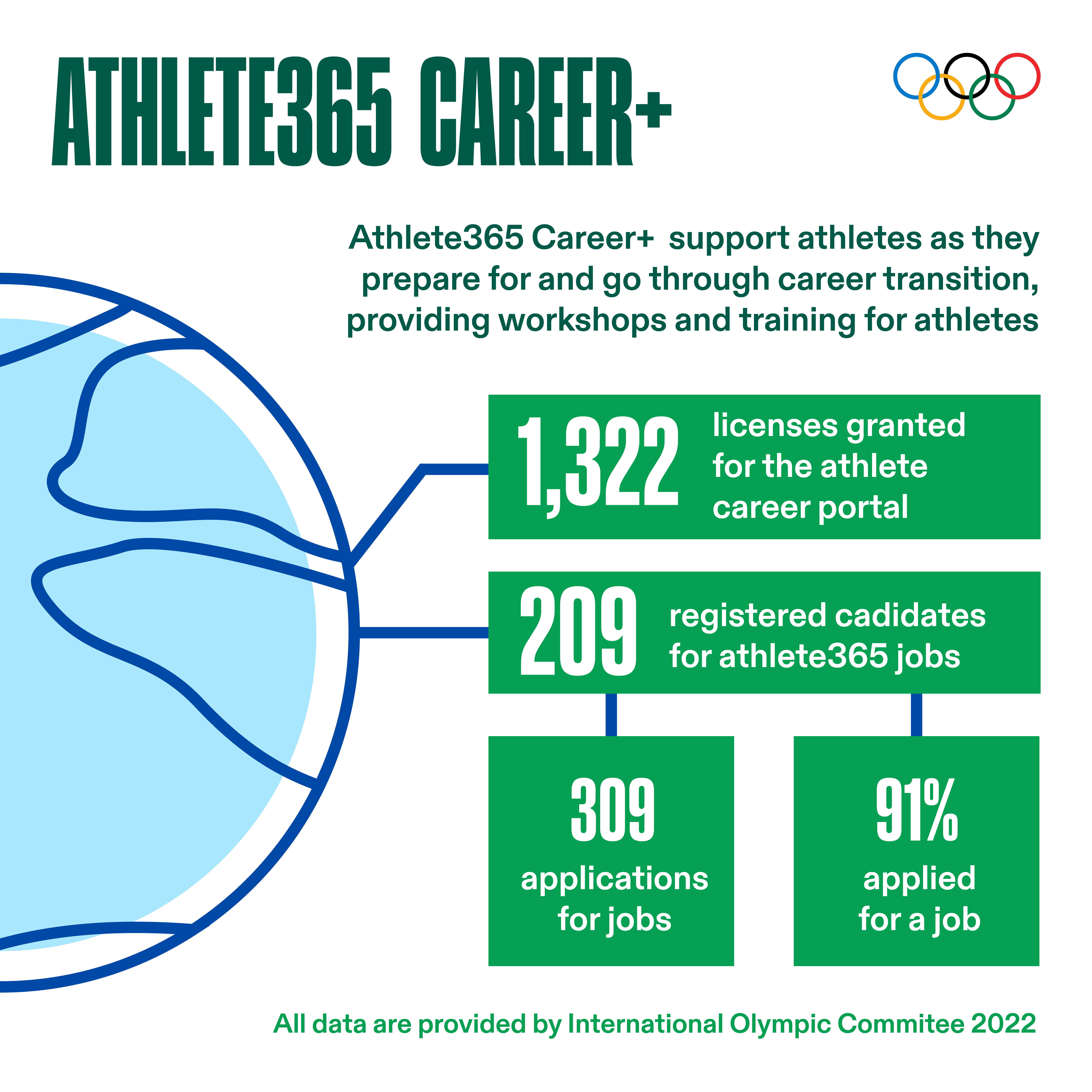
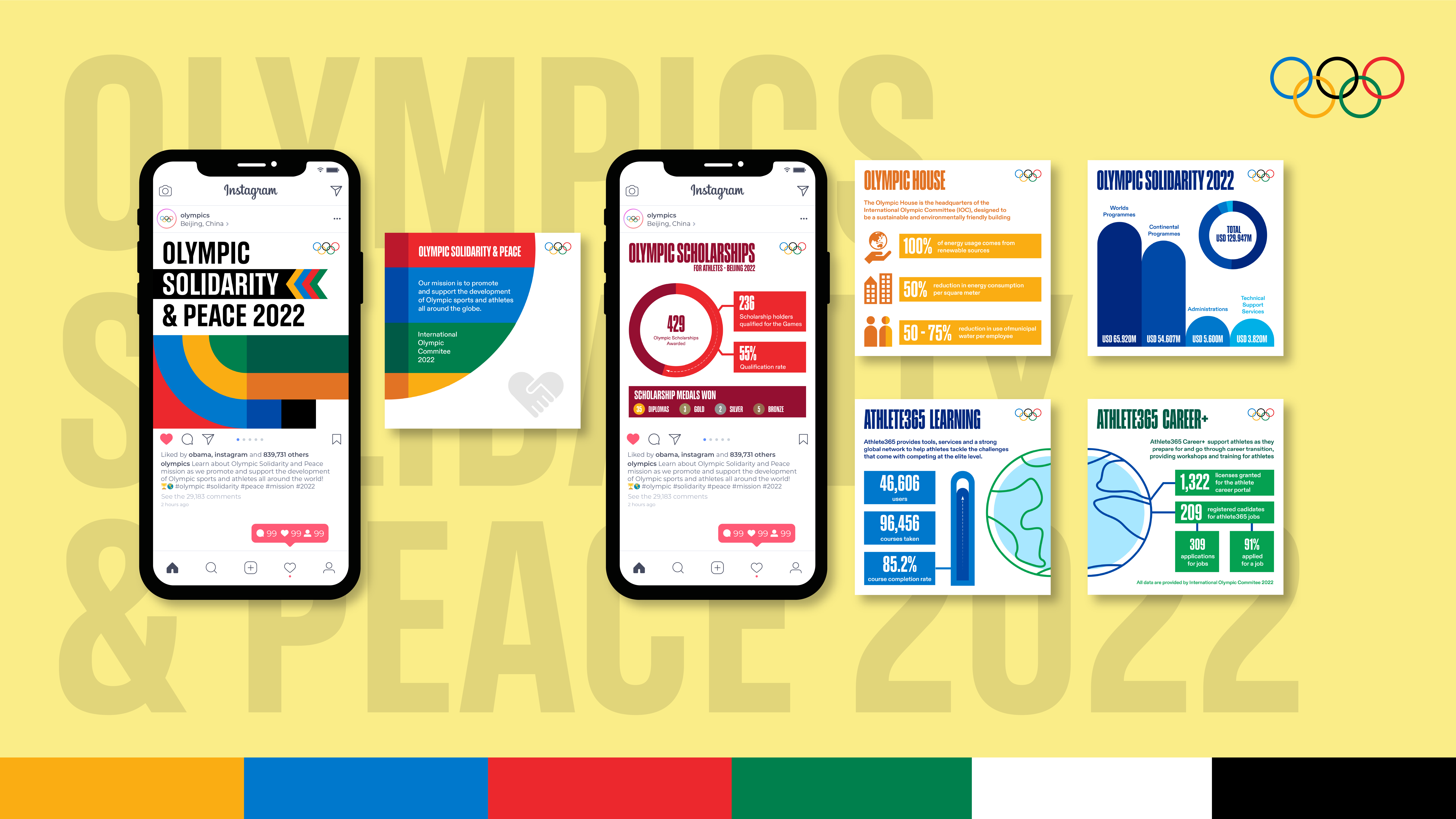
Creating social media posts showcasing 2022 Olympics solidarity statistics. These stats include information on Olympic spending for scholarships, early careers, athlete learning systems, Olympics house investment, and different areas where the money was spent on.
Project Goals
Given that this project is an extension of the Olympics infographic, following their guidelines is crucial. My aim is to learn how to follow guidelines effectively and appropriately, as many bigger brands often have strict predefined boundaries.
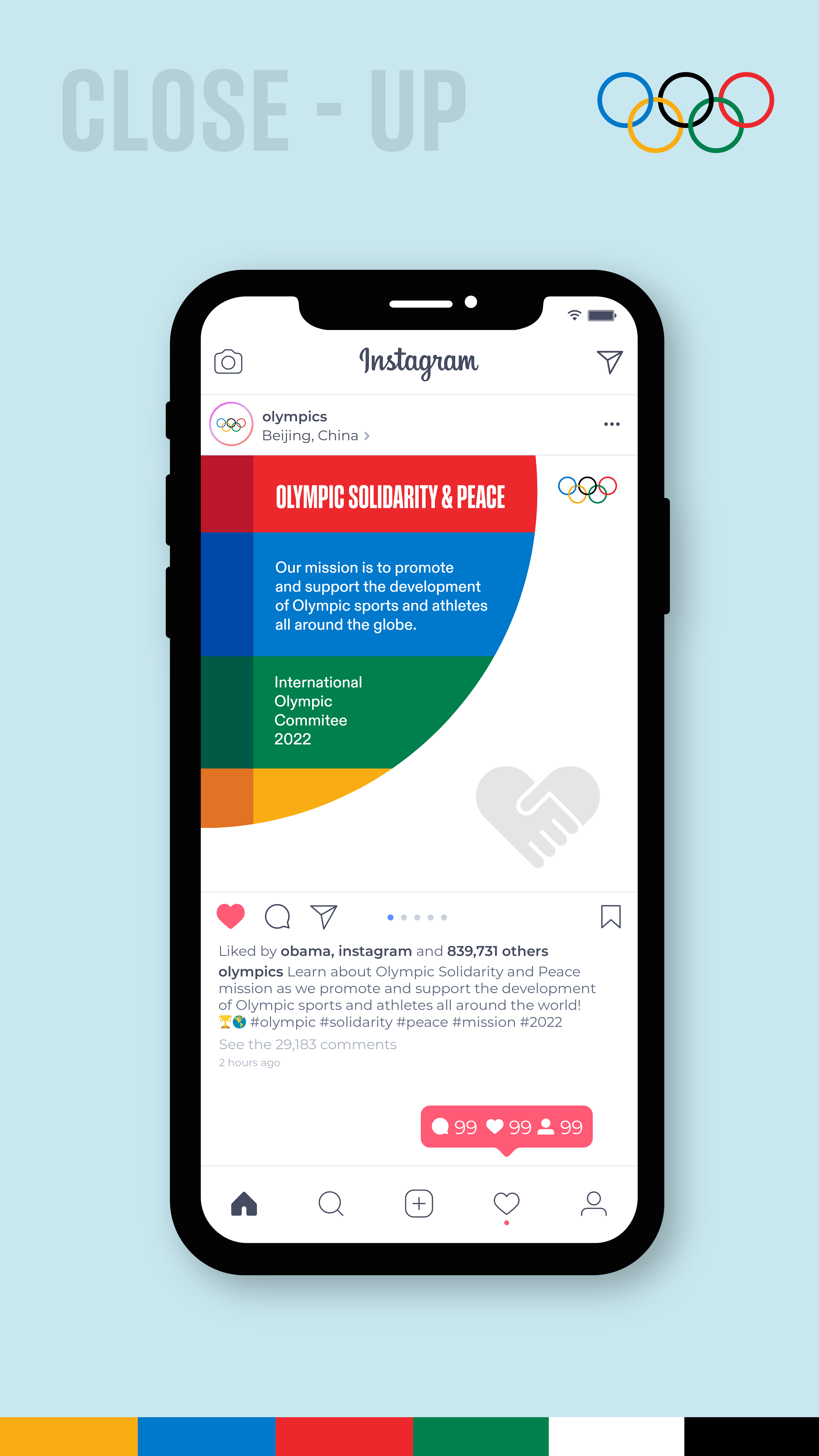
Fusing an "Olympic" Vibe into Instagram Posts
Following the brand guidelines is essential, but as a designer, the challenge is to infuse uniqueness while maintaining the Olympic feel. My first step involves examining how they expand their previous brand, which includes geometric shapes and the primary four colors.
The Olympic style leans towards minimalism, avoiding an overload of content in a confined space. Therefore, it's crucial to prioritize overall layout and aesthetics over cramming excessive content together.
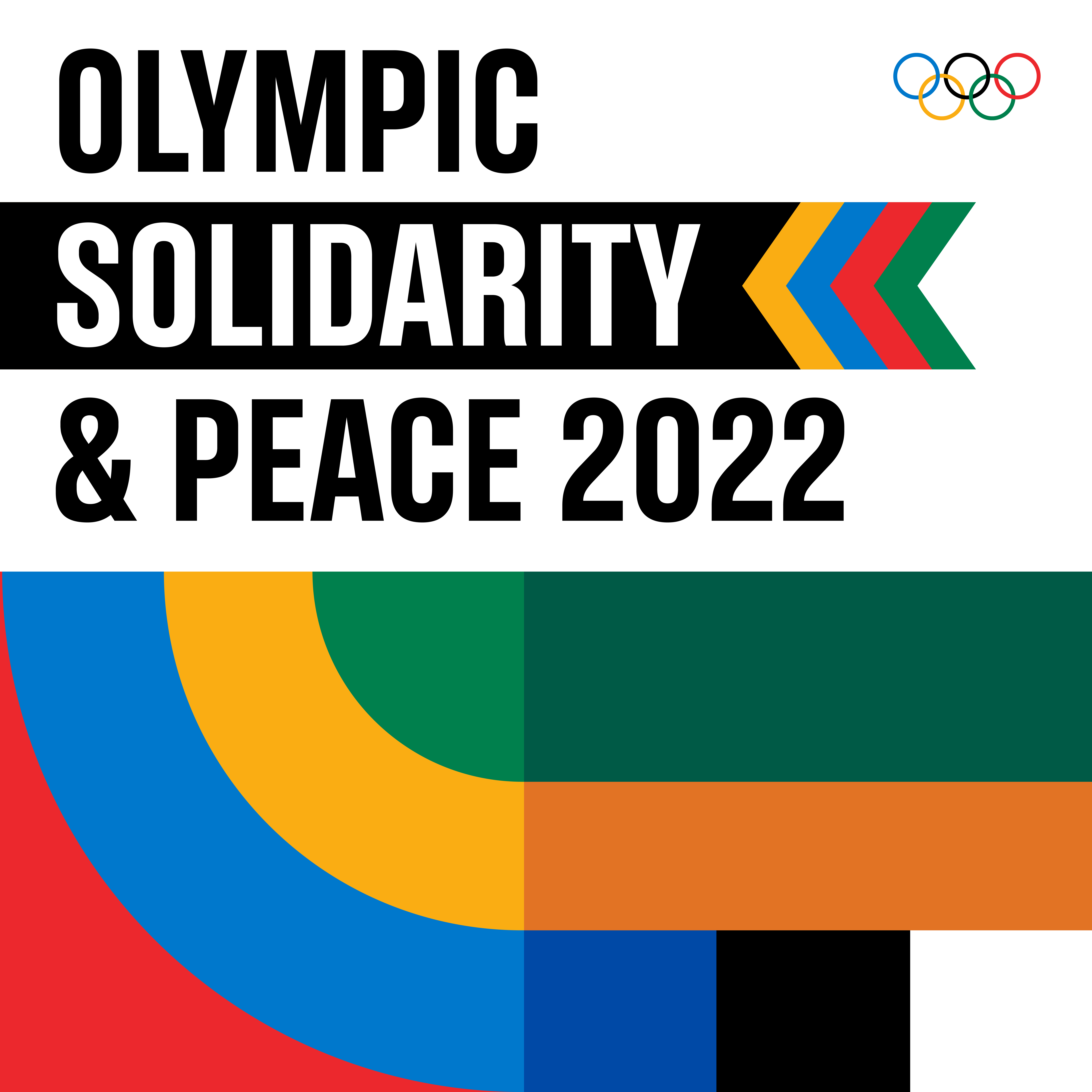
Get Their Attention
Making eye-catching infographics is important, but it's also crucial to keep people interested. If they scroll past your post, it's all for nothing.
To keep them engaged, focus on the main idea, avoid long texts, and use colorful visuals to encourage them to swipe for more. Keep them curious by revealing info bit by bit instead of overwhelming them all at once.
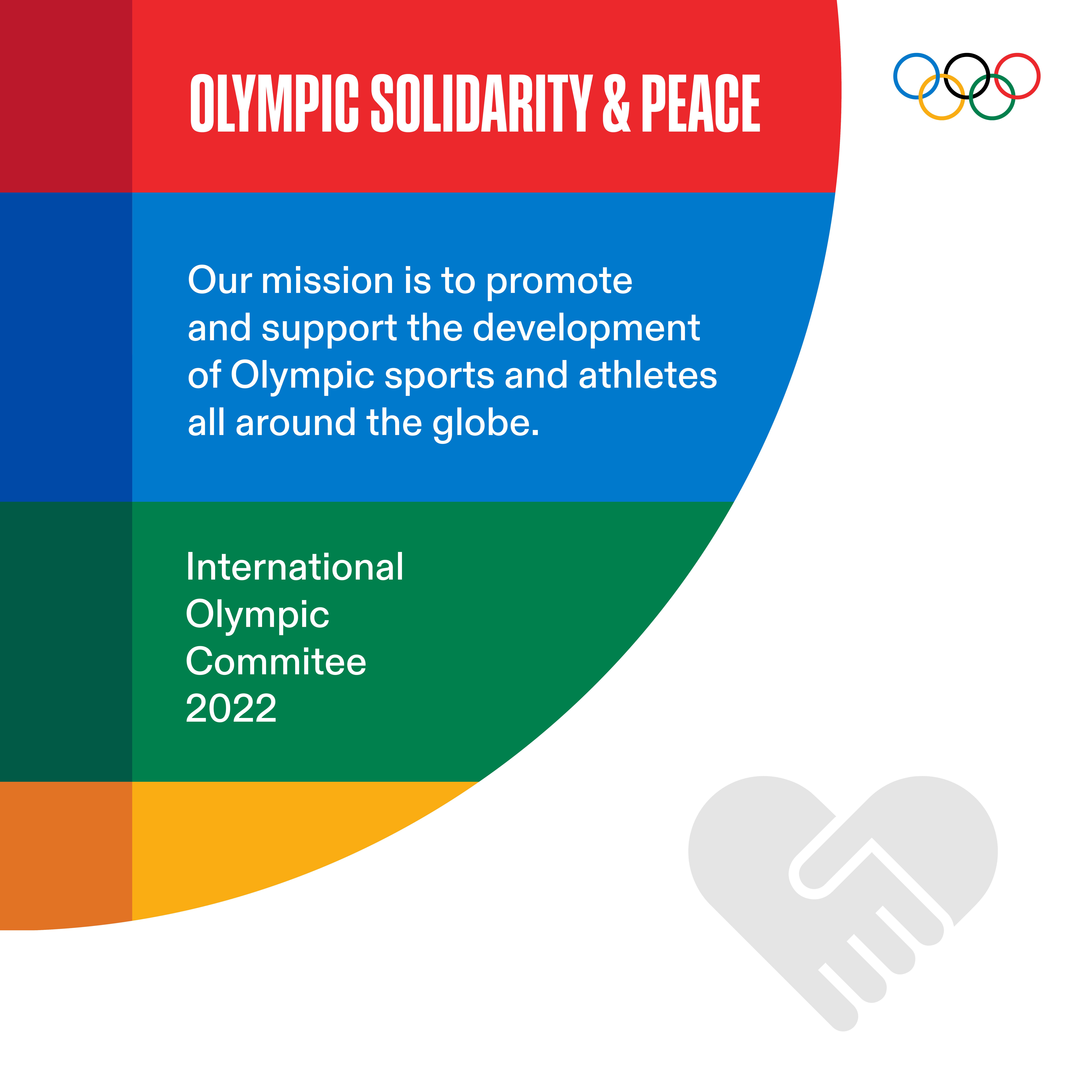
Highlight Your Post
Now that the user has swiped left, you've got their attention. Use this to your advantage. Give them a brief summary of why your post matters and why they should keep swiping to learn more. Keep them curious and give them a reason to keep going.
Define Your Content
To keep users engaged, ensure your content is consistent in style and theme. Inconsistencies can confuse them and make them lose interest.
Create visually attractive content by linking slides together. Make it clear that there's more to discover as they swipe to the next slide.
REFLECTION
What I learned
I picked up valuable skills in managing my designs to align with the guidelines and restrictions. Following these guidelines taught me how to space logos appropriately, a skill that can apply to any logo design. I also learned effective spacing between content elements to prevent overcrowding.
What could be improved
I think creating smoother transitions between each post could enhance the sense of unity. While each individual post included a color from the Olympics rings, using more colors could better represent the diversity of the Olympics palette.
