Maggie Miley's
OVERVIEW
Role:
Project Lead
UI Designer
Timeline:
~ 3 weeks (25 hours)
Software Used:
Adobe XD, Photoshop
Project Details
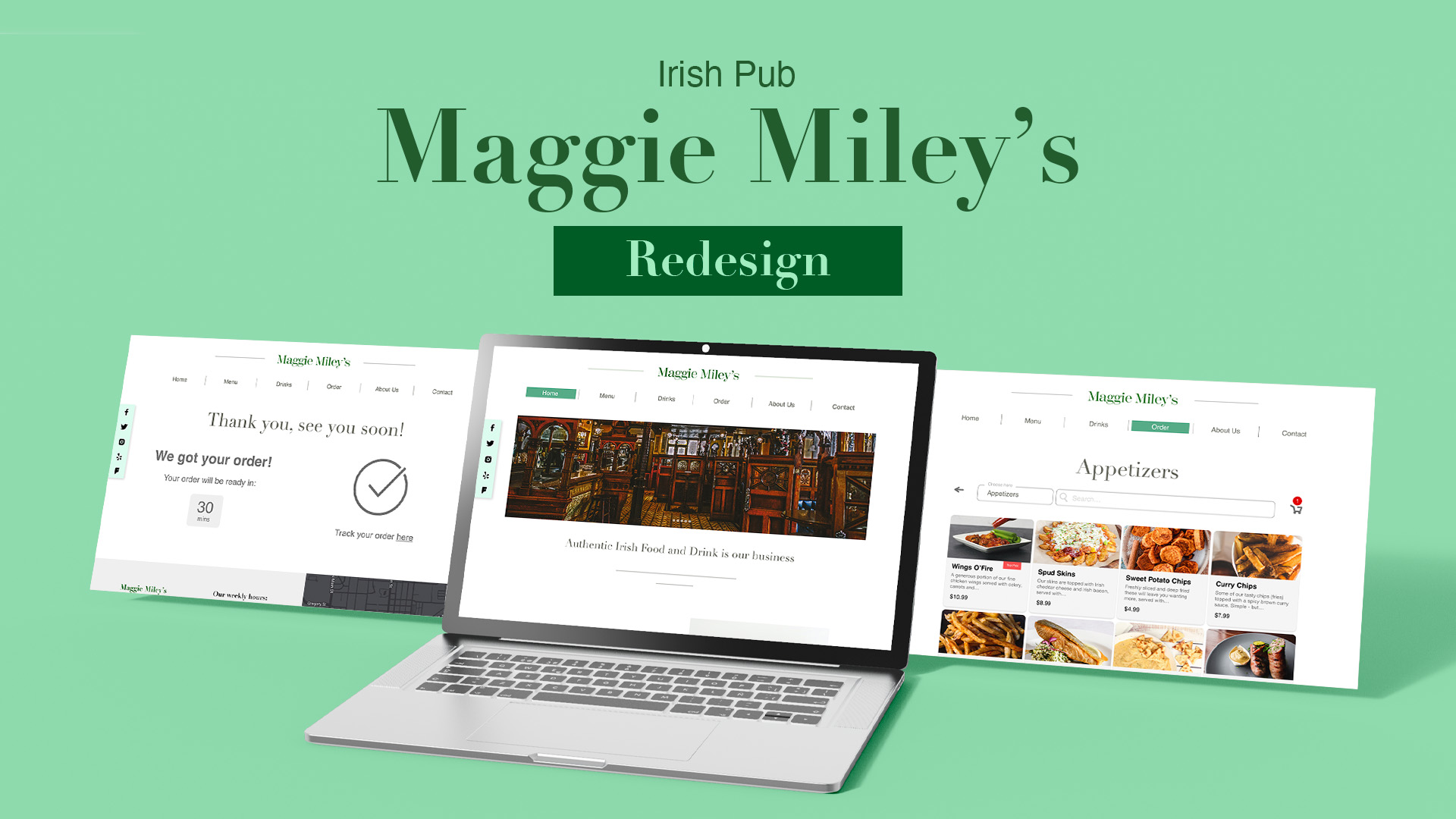
I redesigned a local business's website that appeared unappealing and outdated. Instead of recoding the entire site, the focus was mainly on redesigning the layout for a more pleasing and user-friendly appearance. The primary goal was to simplify the customer's experience, making it both visually appealing and user-friendly.
Project Goals
The project aimed at learning how to redesign a website without altering its content, focusing on the consumer's perspective to understand their overall experience. Specifically, the main focus was on improving the customer's experience with online food ordering.
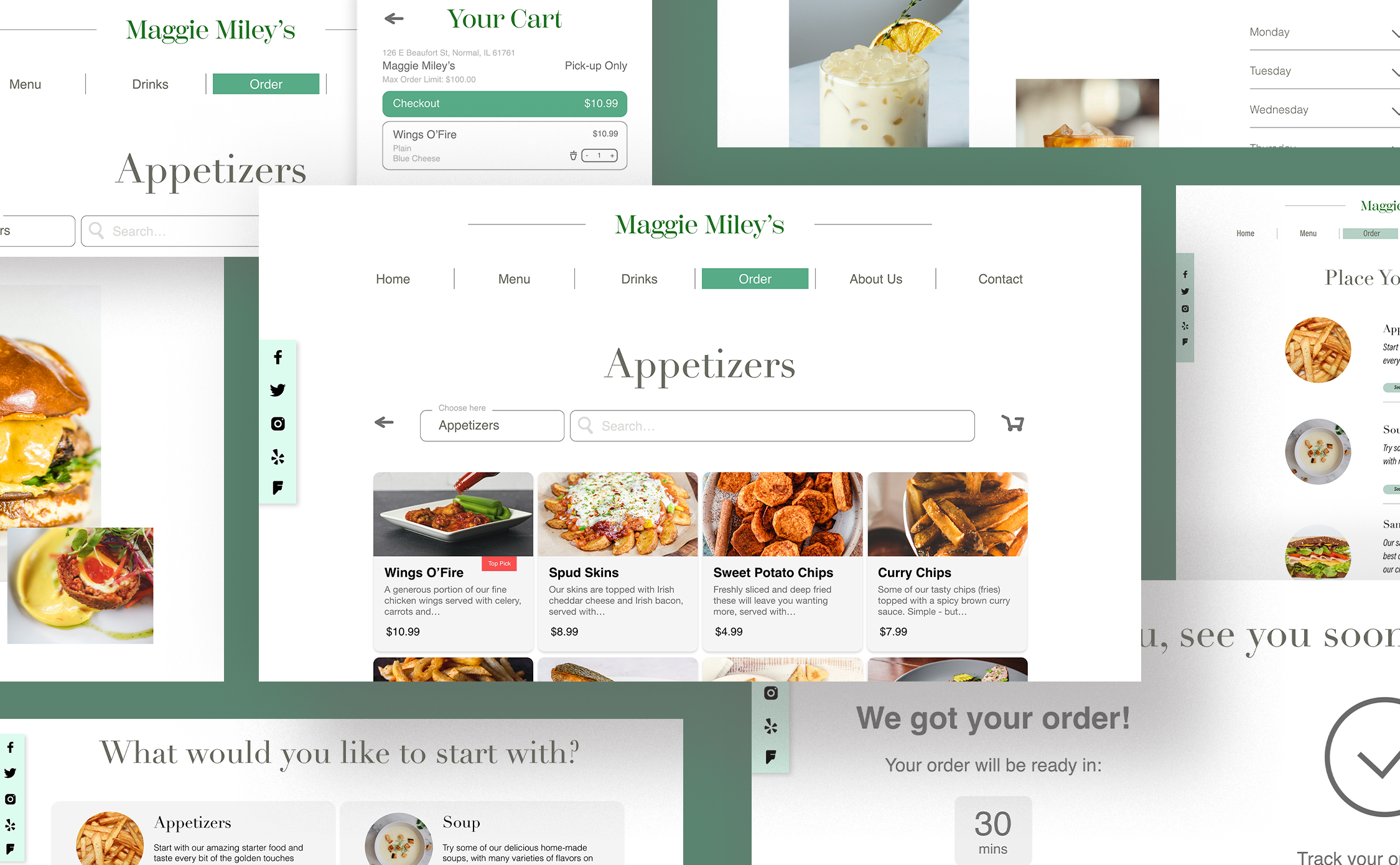
Maintaining consistency across all pages is crucial for a cohesive website style, creating a less confusing and more seamless experience for users.
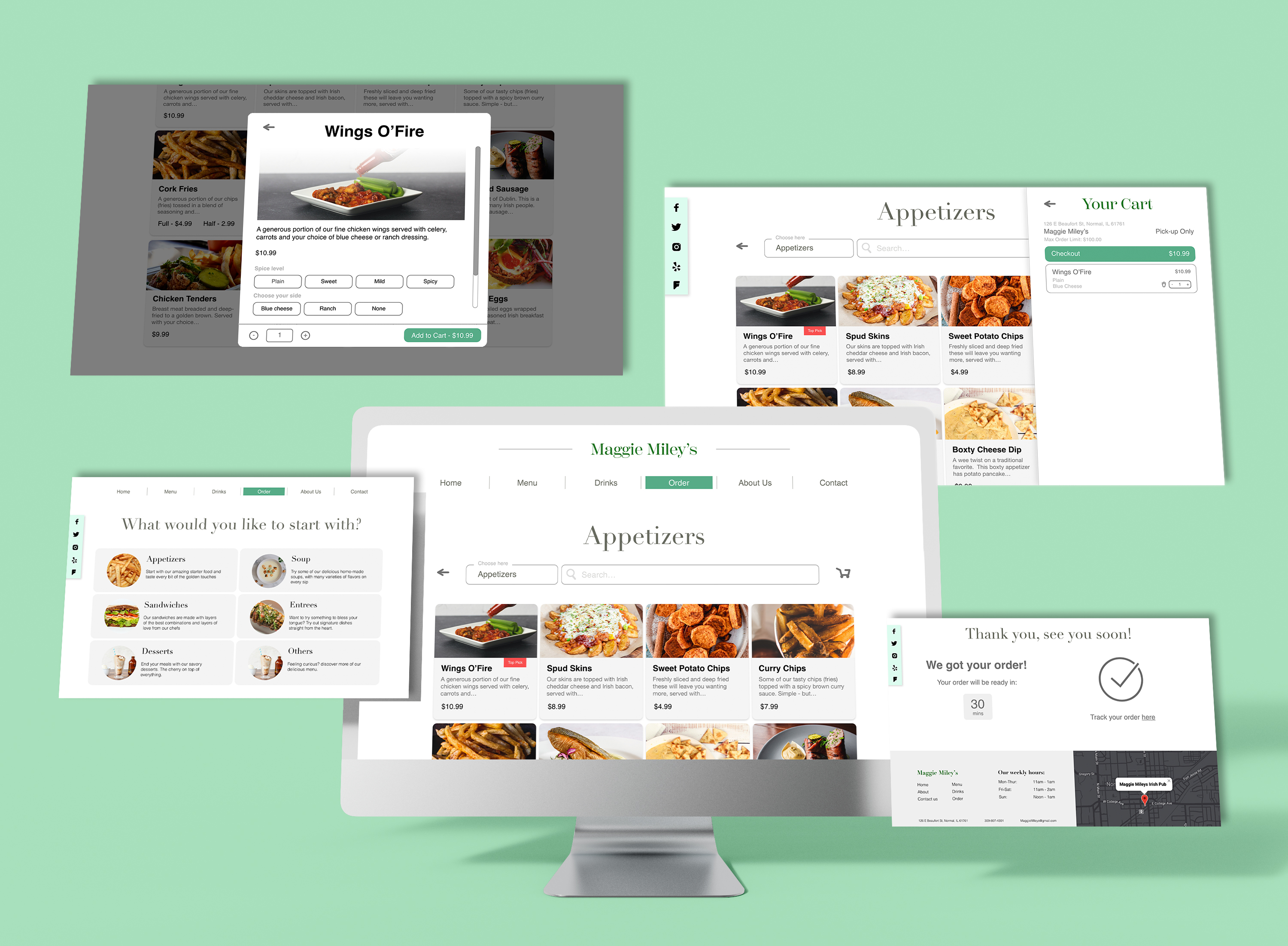
To streamline the online food ordering process, it's essential to provide users with a familiar experience rather than introducing unnecessary complexity. Reinventing the wheel may only lead to user confusion, so sticking to what already works is key.
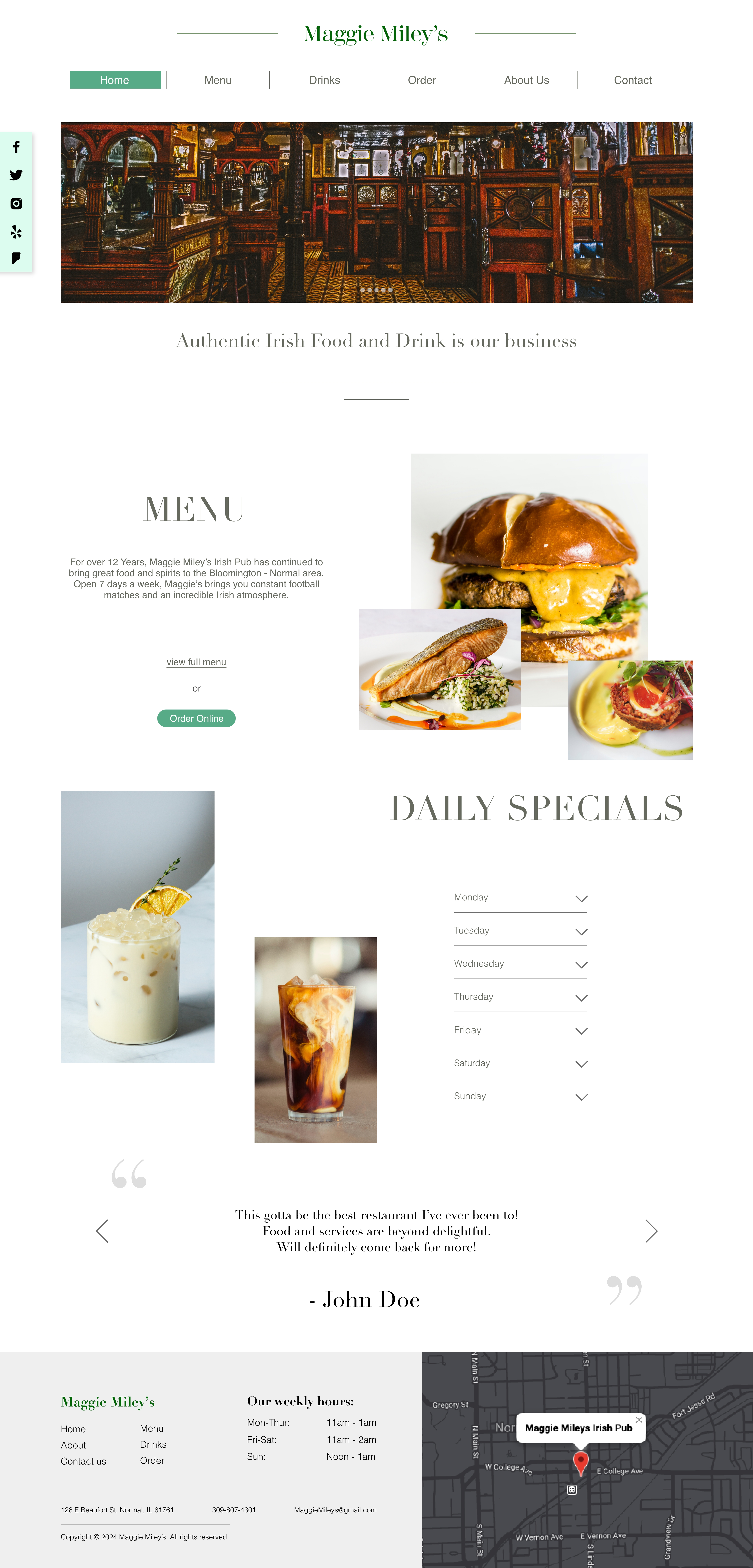
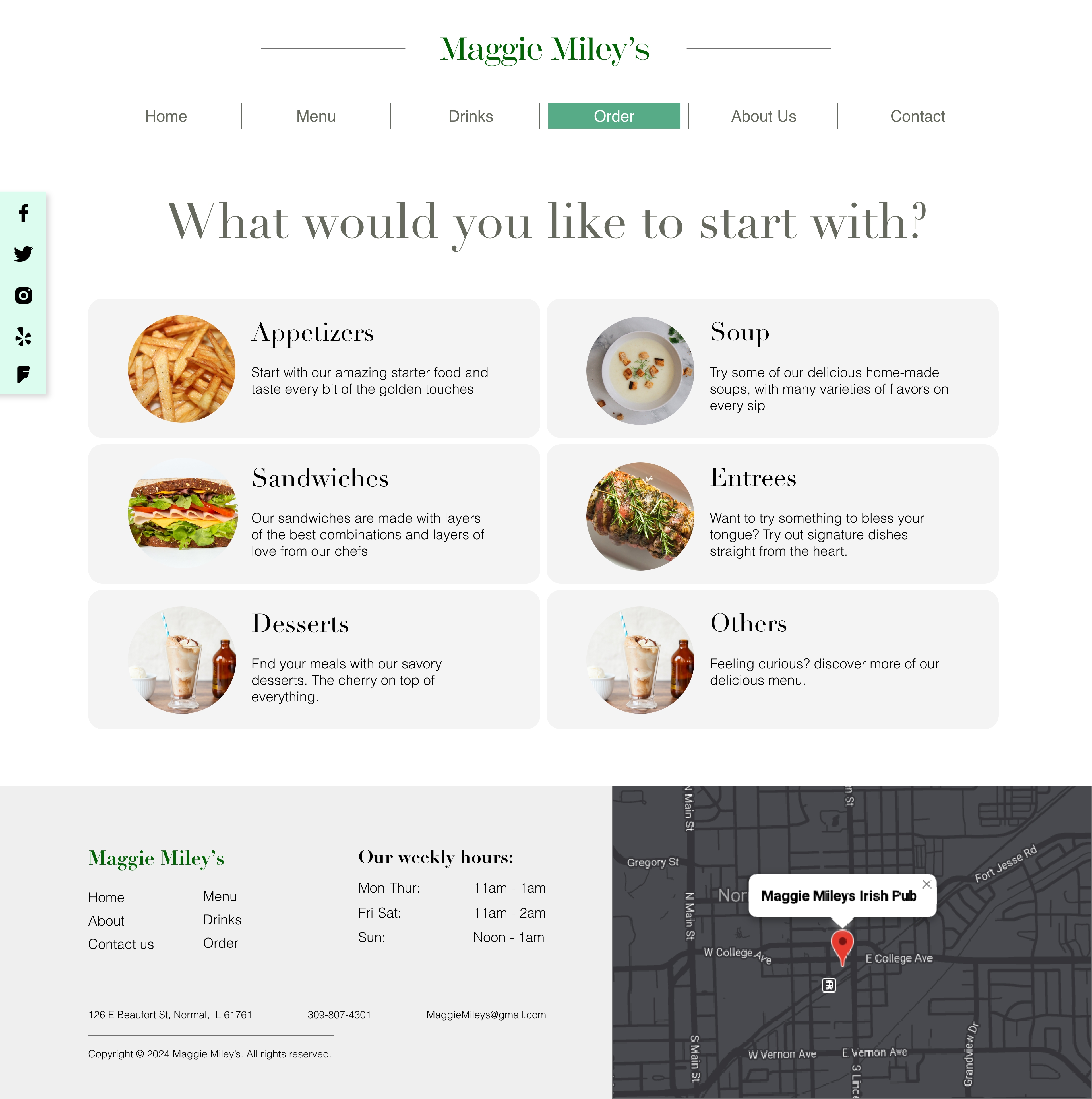
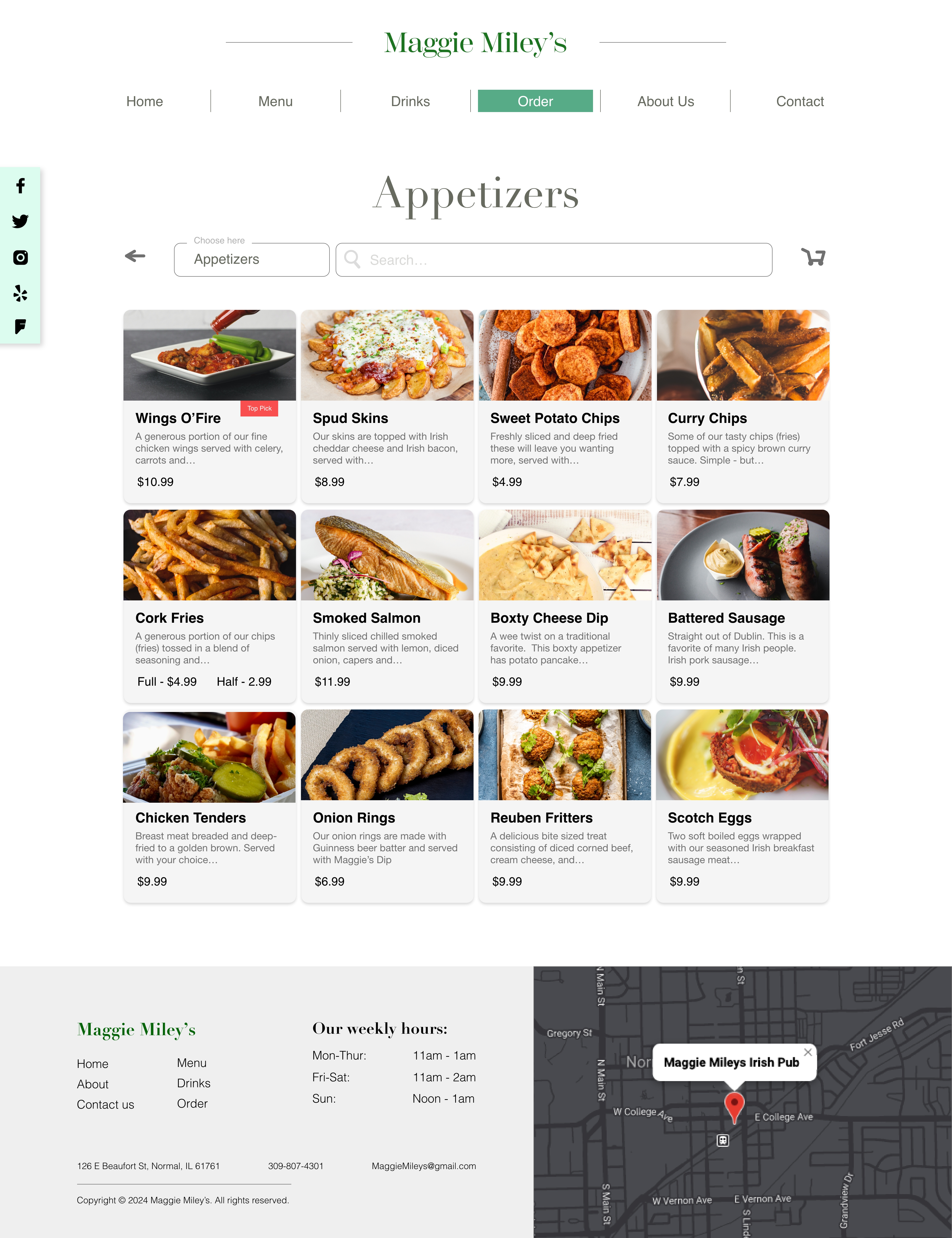
The redesigned website distinguishes itself by its enhanced appeal to users. Leveraging images effectively stimulates users' appetites for restaurant cuisine. By prominently featuring menu items alongside corresponding images, while maintaining clear pricing and descriptions within a card layout, we achieve a visually engaging and efficient design.
REFLECTION
What I learned
While redesigning the site layout, I always kept in mind the importance of readability, legibility, and accessibility. A key focus was on enhancing the overall customer interaction, considering:
How easily users can find tasks
How quickly tasks can be completed
The number of clicks required to finish a task
What could be improved
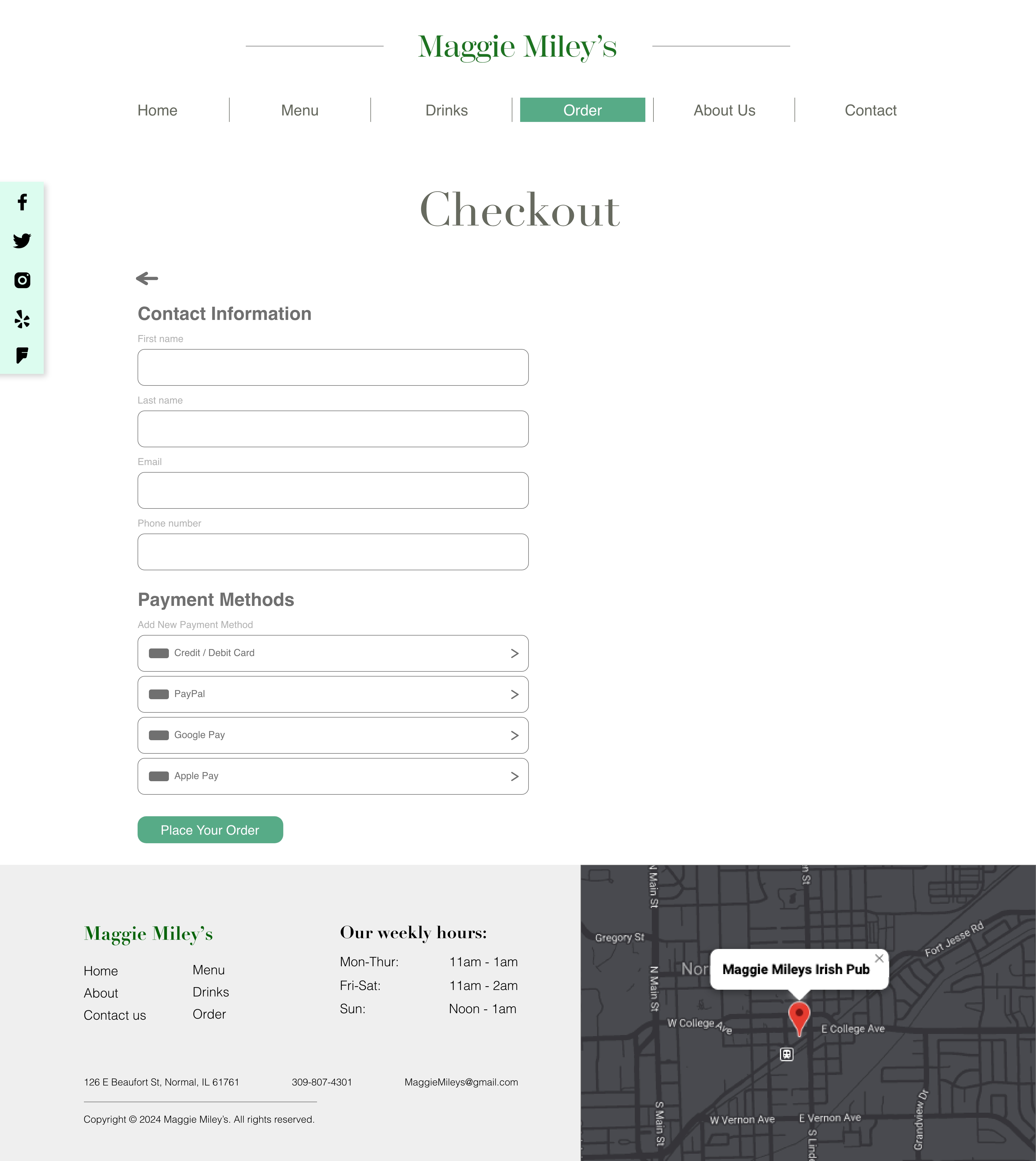
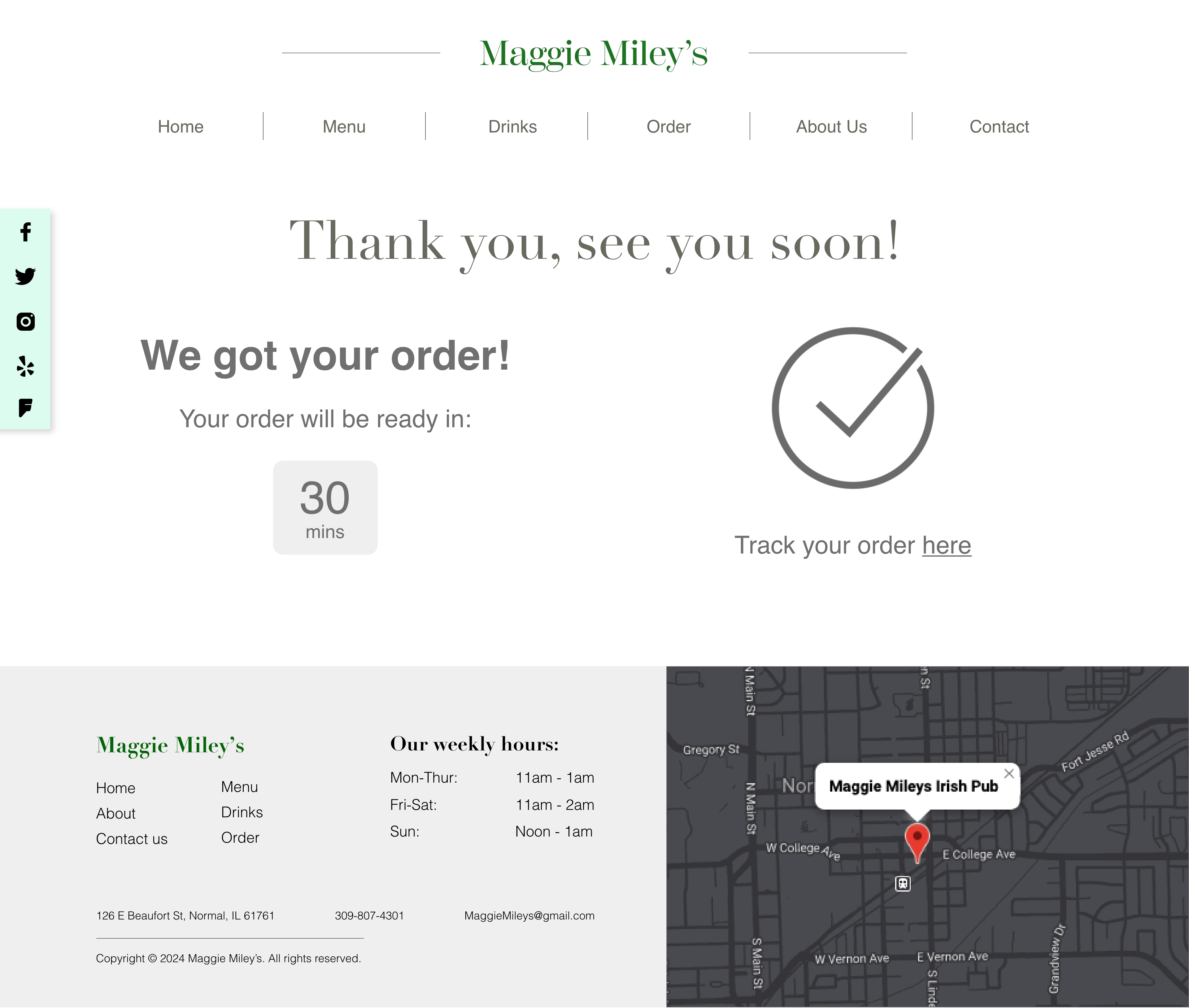
The project's functionality came closely with how I vision it, but I noticed the need for attention to font choices and sizes to better harmonize with the entire site. The online order page presents inconsistencies in page layout and footer, which require adjustments for better uniformity. Despite these, the online order task is generally straightforward and easy to navigate.
