ISU Admissions

OVERVIEW
Role:
Social Media Intern
Graphic Designer
Animator
Timeline:
N/A
Software Used:
Adobe Photoshop, Illustrator, After Effect
Instagram, Twitter, Facebook
Project Details
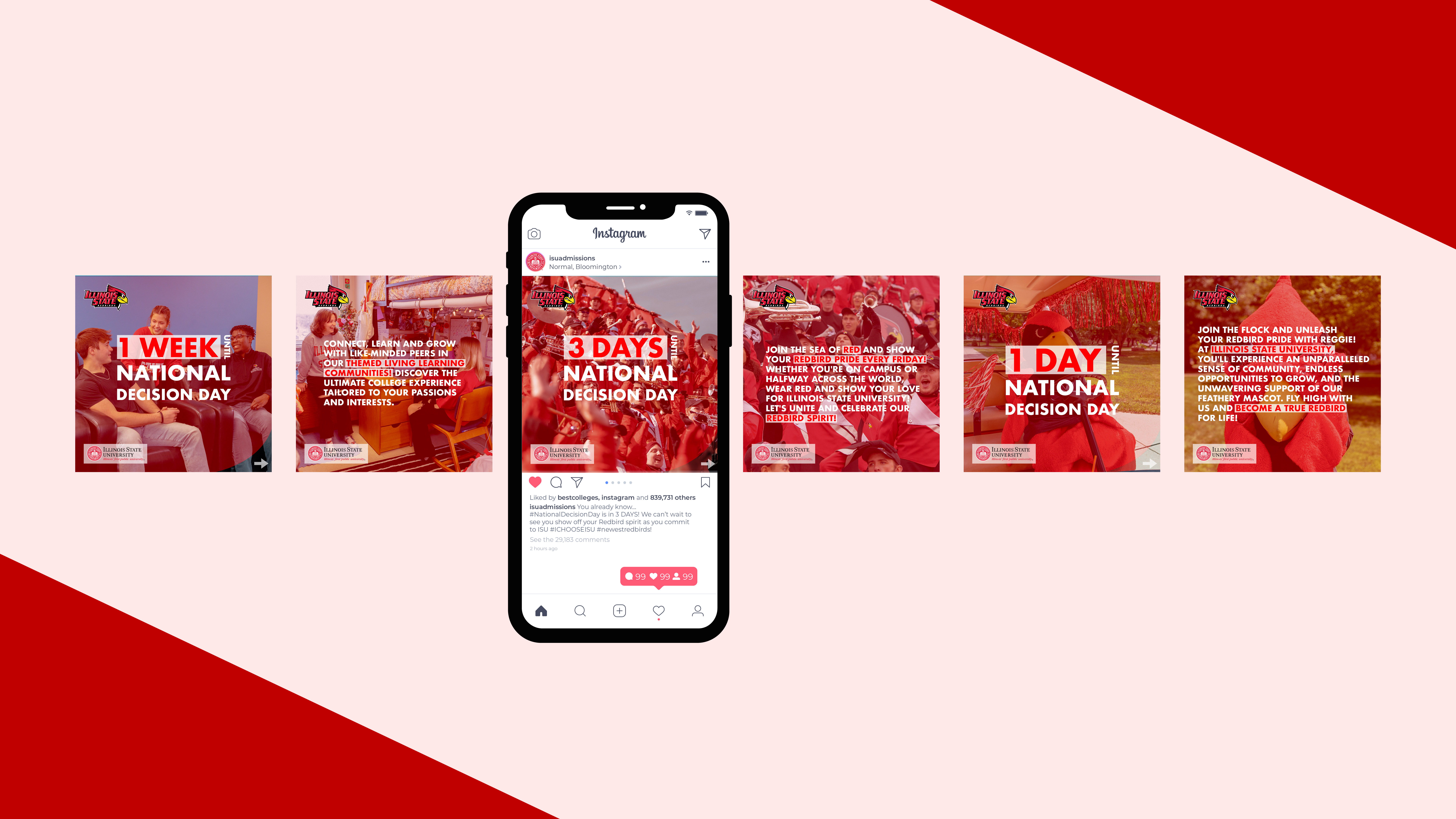
These aren't just single projects; they represent my work throughout my year as a social media intern at the Illinois State University Office of Admissions. My role involved creating appealing and engaging social media posts for future incoming students. Each post had a unique style while still following a set guideline.
Project Goals
To understand and apply an existing brand guideline while implementing new social media strategies to boost audience engagement. I also aimed to understand what makes social media posts entertaining and how to encourage more interaction. Additionally, I wanted to learn about social media algorithms on platforms I was not familiar with, and create a consistency in posting times.

Selecting the appropriate media sizes for various social media platforms is essential to ensure your images appear correctly without getting cropped. When composing posts with multiple slides, maintaining seamless transitions between them is key to achieving a cohesive and unified presentation.
Transforming a static image into a dynamic video enhances audience engagement and extends content reach. By incorporating motion, videos captivate viewers' attention, leading to increased engagement. When integrating text within videos, careful consideration of reading time per phrase is essential. Ensuring text durations align with the average viewer's reading speed optimizes impact and comprehension.


Enhancing user engagement involves creating a sense of presence, where users feel included in the virtual experience. For instance, incorporating snow effects for winter merchandise promotions can evoke seasonal ambiance. Additionally, including a clear call to action prompts users to easily navigate to advertised content. This combination of inclusive design and effective calls to action significantly boosts user attention and engagement rates.
REFLECTION
What I learned
Before diving into new projects or posts, I've learned to check the data analytics of previous posts, using A/B testing to understand what works and what doesn't. Beyond following guidelines, I also consider visualizations and the audience's attention span. Crafting post descriptions is equally important for effective communication and calls to action.
What could be improved
Can use more of a consistent style and aesthetic that enhances the overall page, making it more unified and recognizable as the brand. Other than improving visual elements, my thoughts on the post descriptions could be more active and include better calls to action.
