Dcode
OVERVIEW
Role:
User Flow Director
Prototype Manager
Team: Evan Schuller, Maddie Chilton, and Me
Timeline:
~ 1.5 weeks (10 hours)
Software Used:
Adobe XD, Illustrator
Project Details
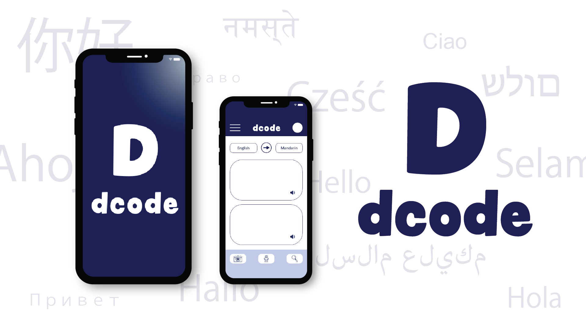
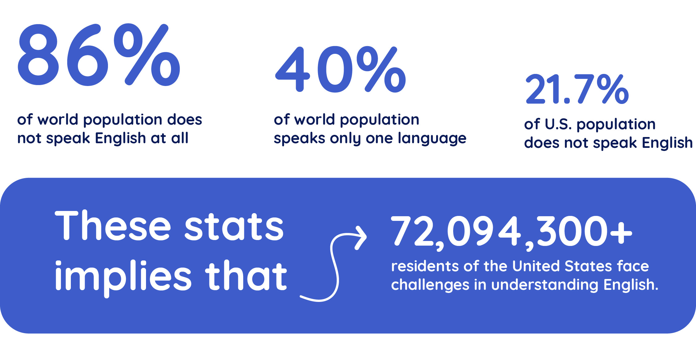
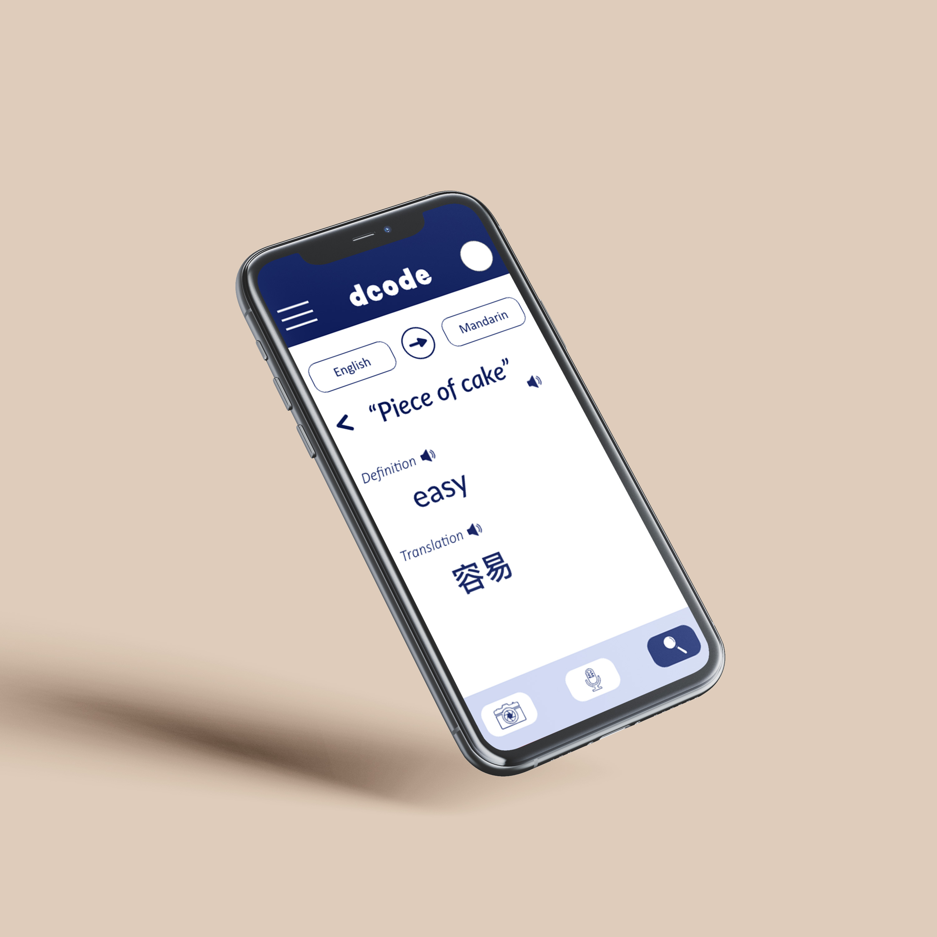
Dcode is a specialized LIVE translator app designed to solve various user language challenges. It offers multiple functions, including translating images, voice, and common slangs. The app features a text-to-speech function and employs colors suitable for users with visual disabilities.
Project Goals
This short project prioritizes functionality over aesthetics, so we aim to make the app operational. The goal is to explore multiple functions that bridge language barriers in real-time, using user challenges as the guide. We try use user research to identify and plan the essential features the app needs.
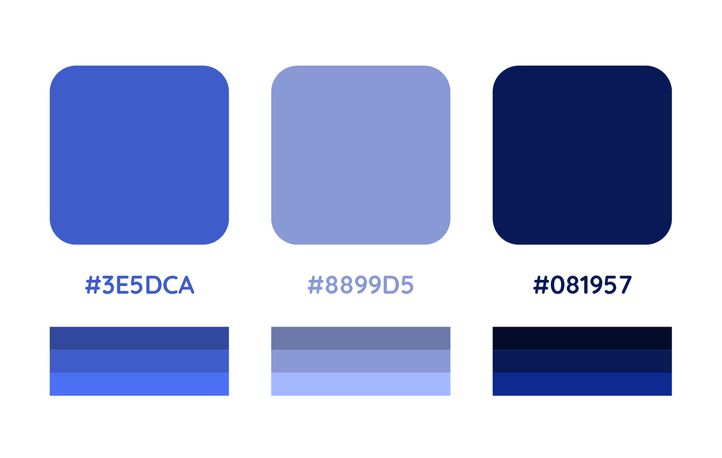
While designing the app, we must prioritize accessibility, considering not only language barriers but also addressing users' visual challenges. Therefore, we opted for three blue-toned colors, tested for compatibility, and ensured easy readability for various visual disabilities, such as monochromatism, dichromatism, and anomalous trichromatism.
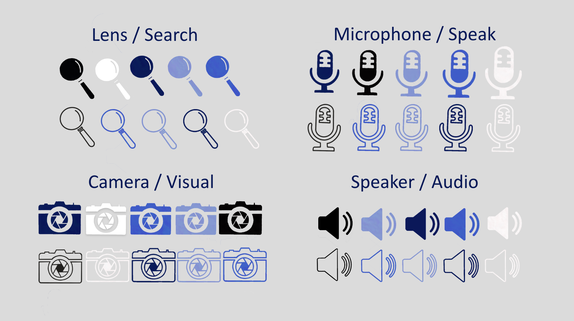
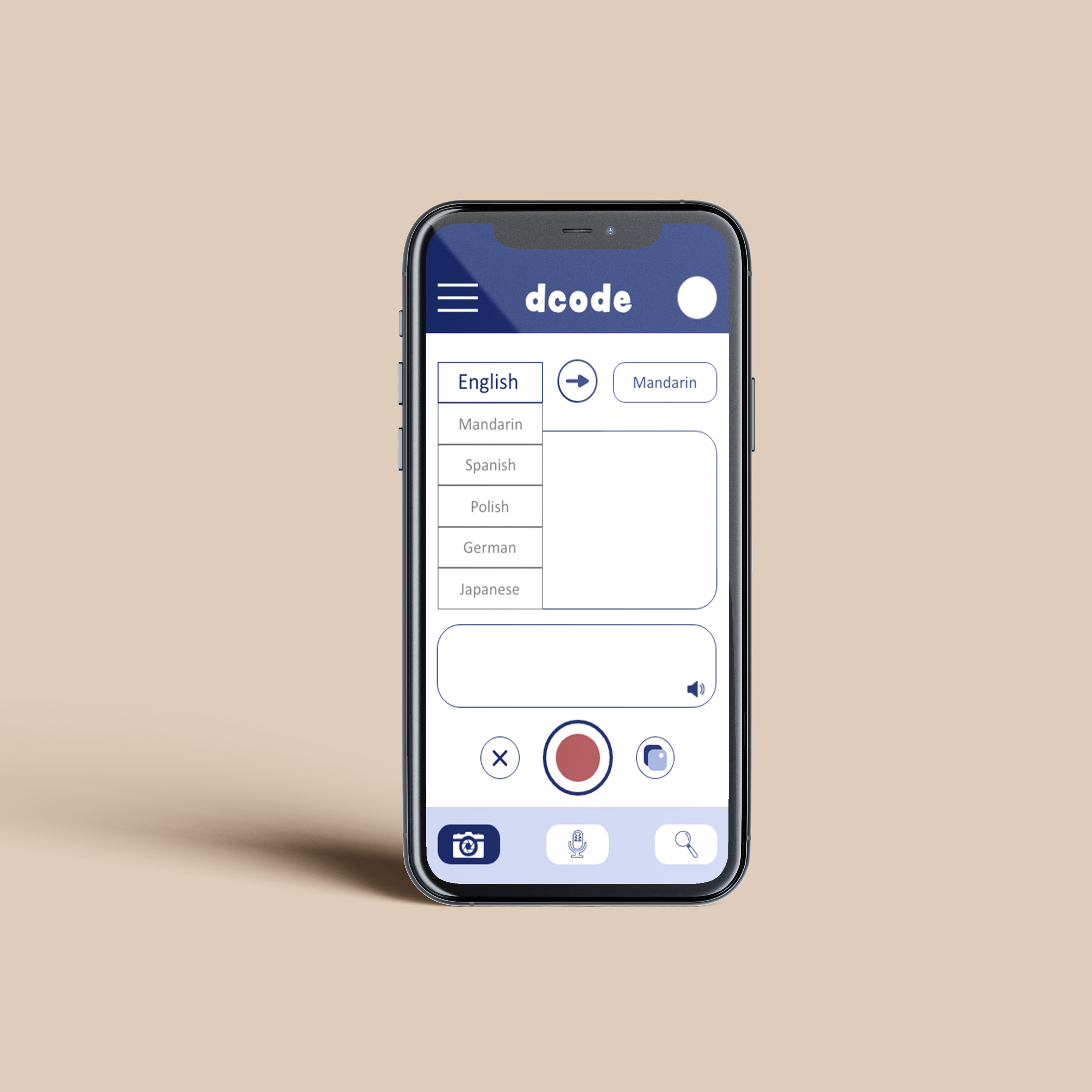
To enhance user experience in our app, we should incorporate universally recognized icons. Icons such as a magnifying glass for search, microphone and speaker for audio functions, and camera for visual tasks are widely understood globally. Utilizing this common iconography can help overcome language barriers for non-native speakers.
Discussion Points
How can we effectively address language barriers within our app? What features should we implement to ensure users feel empowered and navigate the app seamlessly from the moment they start using it? How can we personalize the user experience to cater to individual preferences?
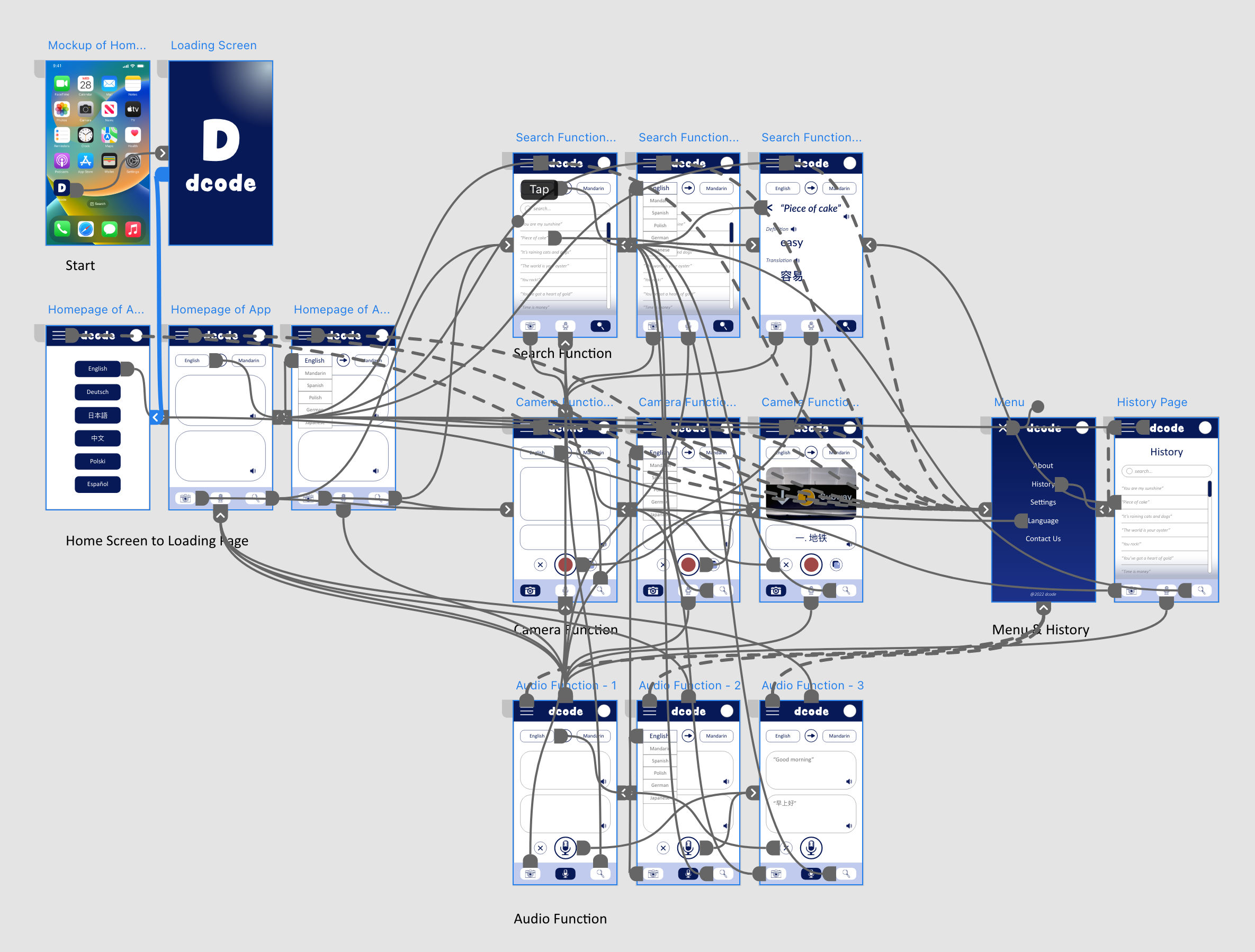
It's essential to make a clear and impactful first impression to capture users' attention from the outset. Providing language options prominently at the beginning of the experience allows users to comfortably select their preferred language without the risk of encountering unfamiliar language barriers.
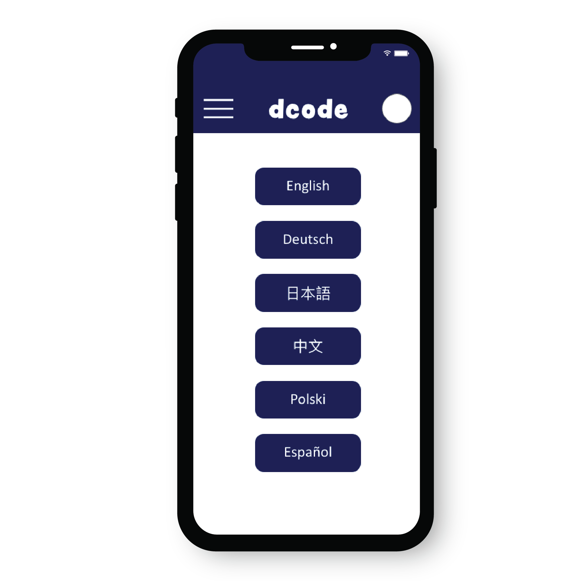
Incorporating a menu with personalized preferences and a history of previous searches can streamline the user's task time by eliminating the need for multiple submissions of the same query. Additionally, this feature offers users flexibility to switch to their preferred language seamlessly.
REFLECTION
What I learned
Conducting user research and analysis accelerates the process of identifying essential features focused on addressing the primary issue - language barriers. Prioritizing user needs and functionality over aesthetics in the early stages is paramount; it involves identifying challenges and devising optimal solutions to eliminate them. Additionally, ensuring the efficiency of user tasks is crucial to delivering a smooth and intuitive experience for all users.
What could be improved
Since our attention focused on functionality, we had limited time to improve the app's aesthetic. Future improvements can be made in typefaces, spacing for better readability, and adjusting colors for overall cohesion. Beyond functionality, our future goal would be to expand the app's features to solve additional challenges such as physical disabilities and other language barriers among our users.
More Projects

Curious of my full work and experience?
Come check out my resume and portfolio