Charlie Jobson Park
OVERVIEW
Role:
Parts of Initial Design
Color Grader
Animator
Team: Brandon Gilliland, Emma Tully, & Me
Timeline:
~ 3 weeks (30 hours)
Software Used:
Adobe Photoshop, Illustrator, Procreate
Project Details
This is a client project, our design team competed with two other groups to create promotional advertisement for Charlie Jobson's new natural play park. Charlie, the funder, invested a significant amount in this park so it is accessible to students and the community. Being a part of this community when he was young, this project is his way of giving back. Our responsibility was to create an opening day advertisement, which included a park poster, signage, digital banner, and animation.
Project Goals
The primary objective was to design a meaningful and engaging park poster and banner for elementary families and the local community. Our focus is to explore the use of realistic materials on paper while maintaining authenticity.
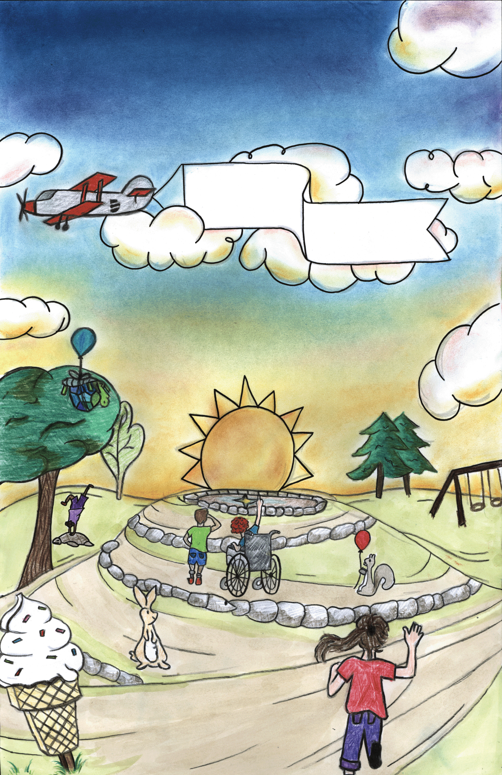
This is the original poster we crafted using colored pencils, crayons, and pastels. Unfortunately, after scanning it, the colors appeared diluted, making the whole poster less appealing.
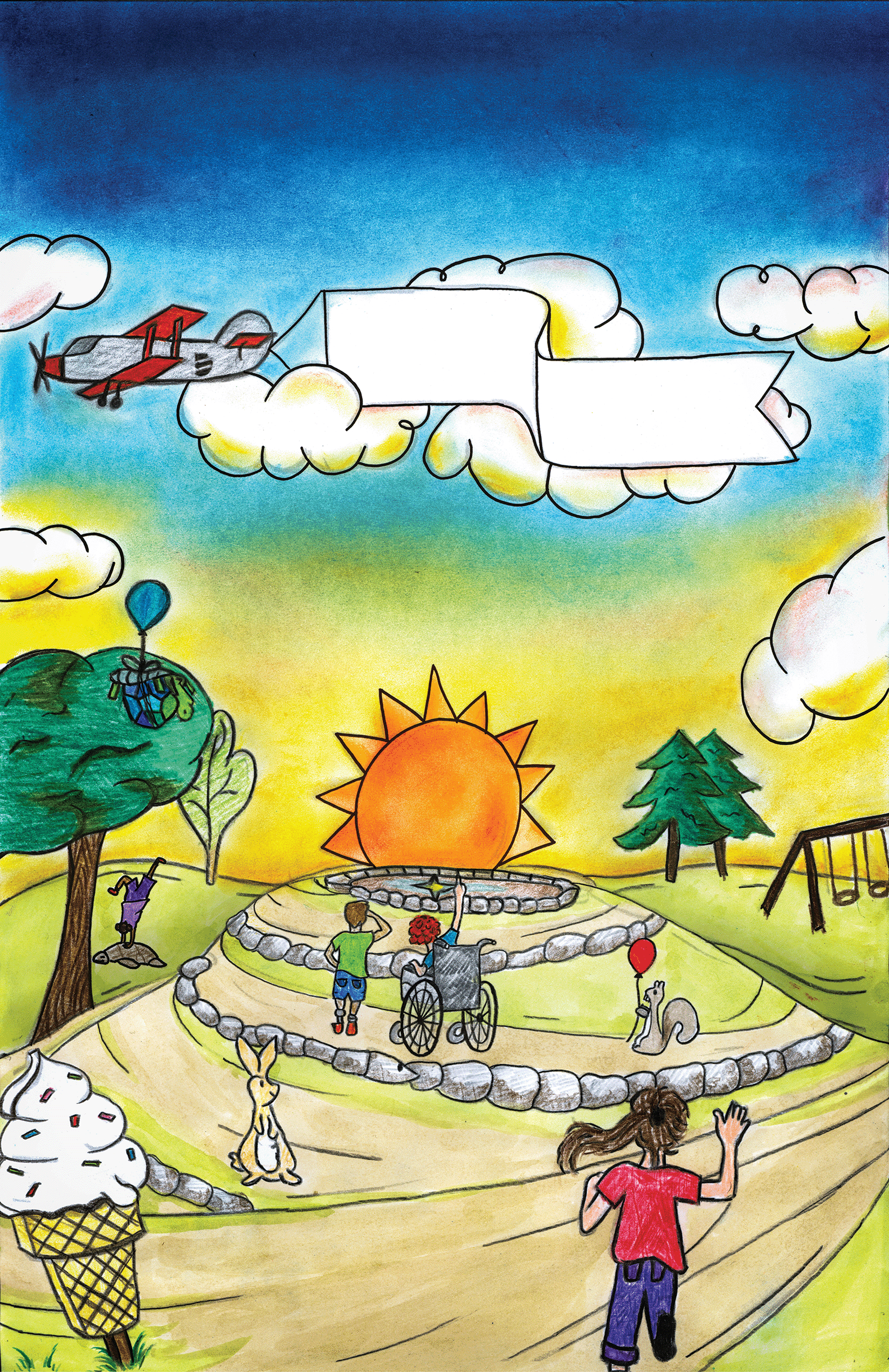
This is the edited poster processed through Photoshop, using color correction to increase saturation and vibrancy. Additionally, shadows and dark spaces were added to introduce a sense of depth into the design.
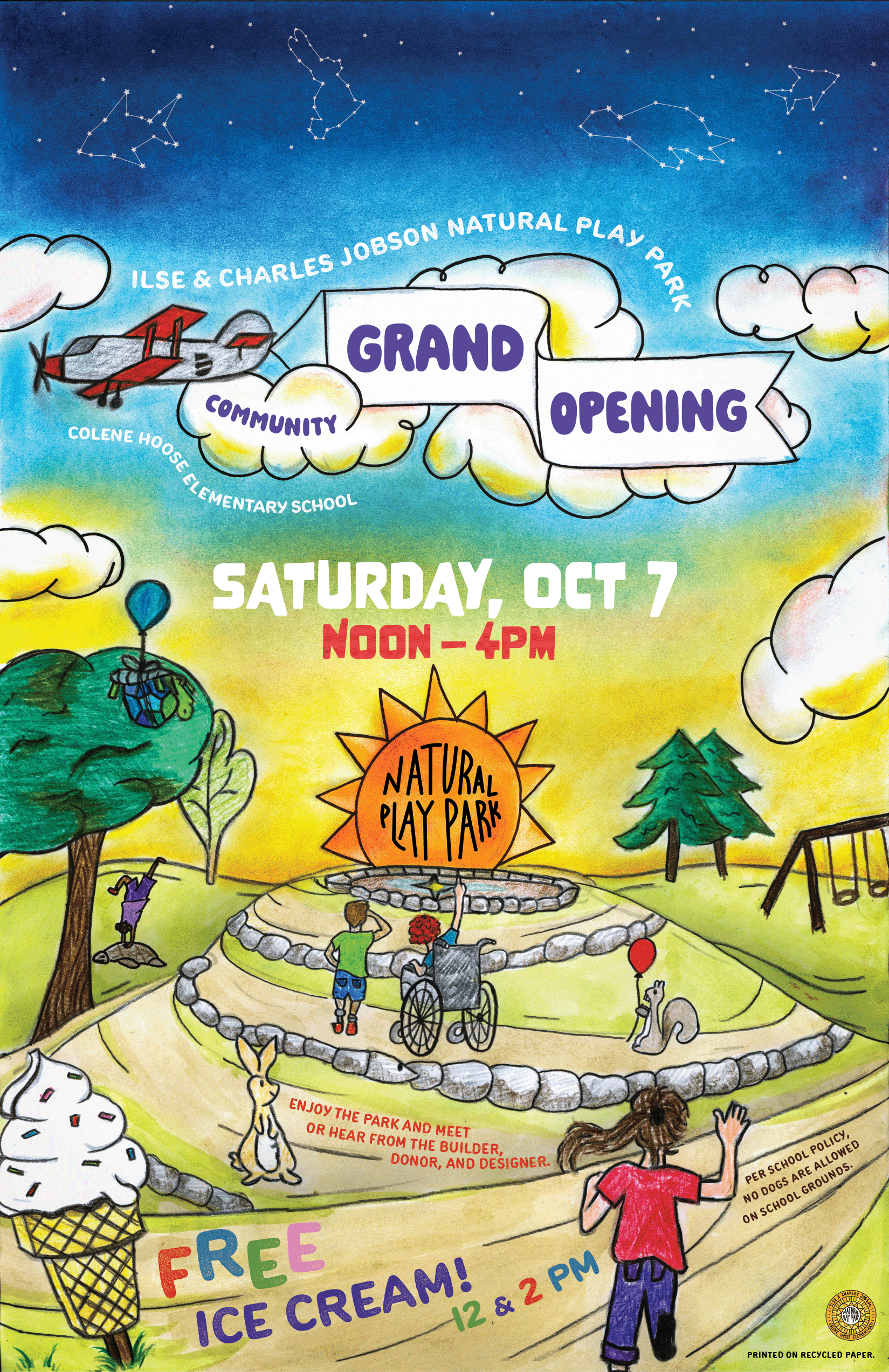
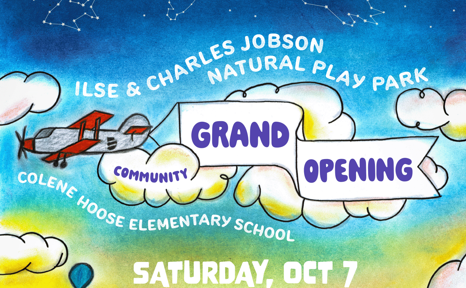
This is the completed version of the poster, featuring added text and images that include logos, the park's name, opening date, mottos, and additional information.
Recognition
Over our big launch, our posters and banners were able to get recognized in multiple sites, articles, and news.
Notable mentions include:
WGLT
Nexstar Media
The Pantagraph
Adam Bienenstock
For the addition, the client requested an animation to capture the park's lively atmosphere. I chose to animate cut-out paper figures to convey a sense of fun and youthful energy, aligning with the park's community-focused, kid-friendly vibe.
REFLECTION
What I learned
Bringing materiality in this poster adds an authentic touch that makes it more meaningful to the audience. Understanding the audience, in this case, families and community members, is crucial. Creating the design towards the targeted audience allowed us to design a poster that appeals to the aesthetics of kids and the community.
What could be improved
Given the time constraints, there wasn't extra time to refine typography and text placements. However, with the available time, we made sure that they were appropriately positioned. While there are minor details in characters and colorings that could be refined, they adds charm to the poster, giving it a childlike and characteristic quality.
More Projects

Curious of my full work and experience?
Come check out my resume and portfolio